

Battery Shopping Experience
Improving the Battery Shopping Experience at Enel X
Scroll to Explore
OVERVIEW
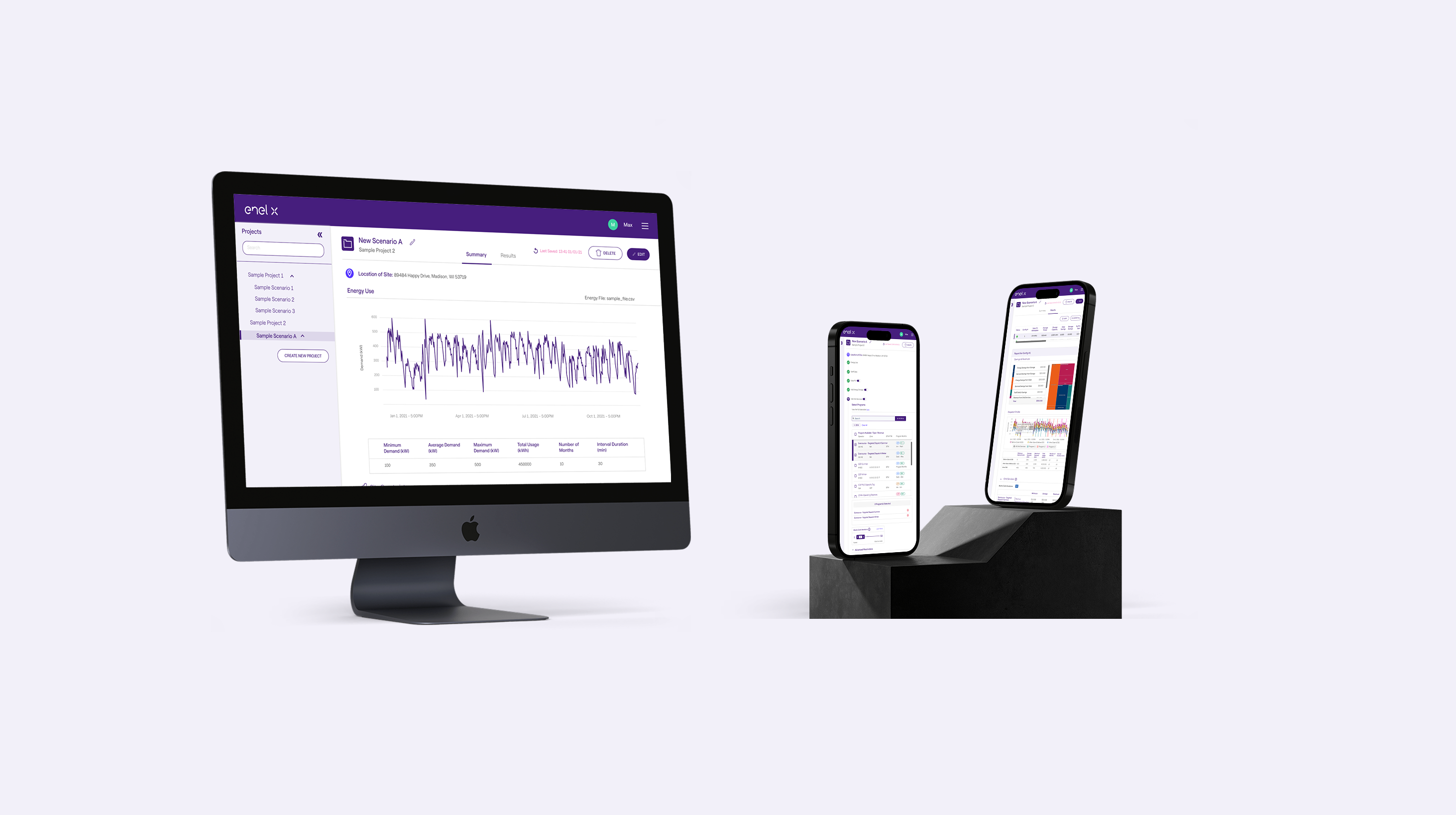
Enel X's Optima application helps users monitor and optimize battery energy storage, balancing electricity supply and demand as renewable adoption grows. This redesign focused on improving accessibility and usability, identifying pain points, and streamlining workflows to make Optima more intuitive and efficient.


The Problem
Grid Services, the largest feature in Optima, lets solution engineers select energy programs for battery operation, each varying by season, location, and function.
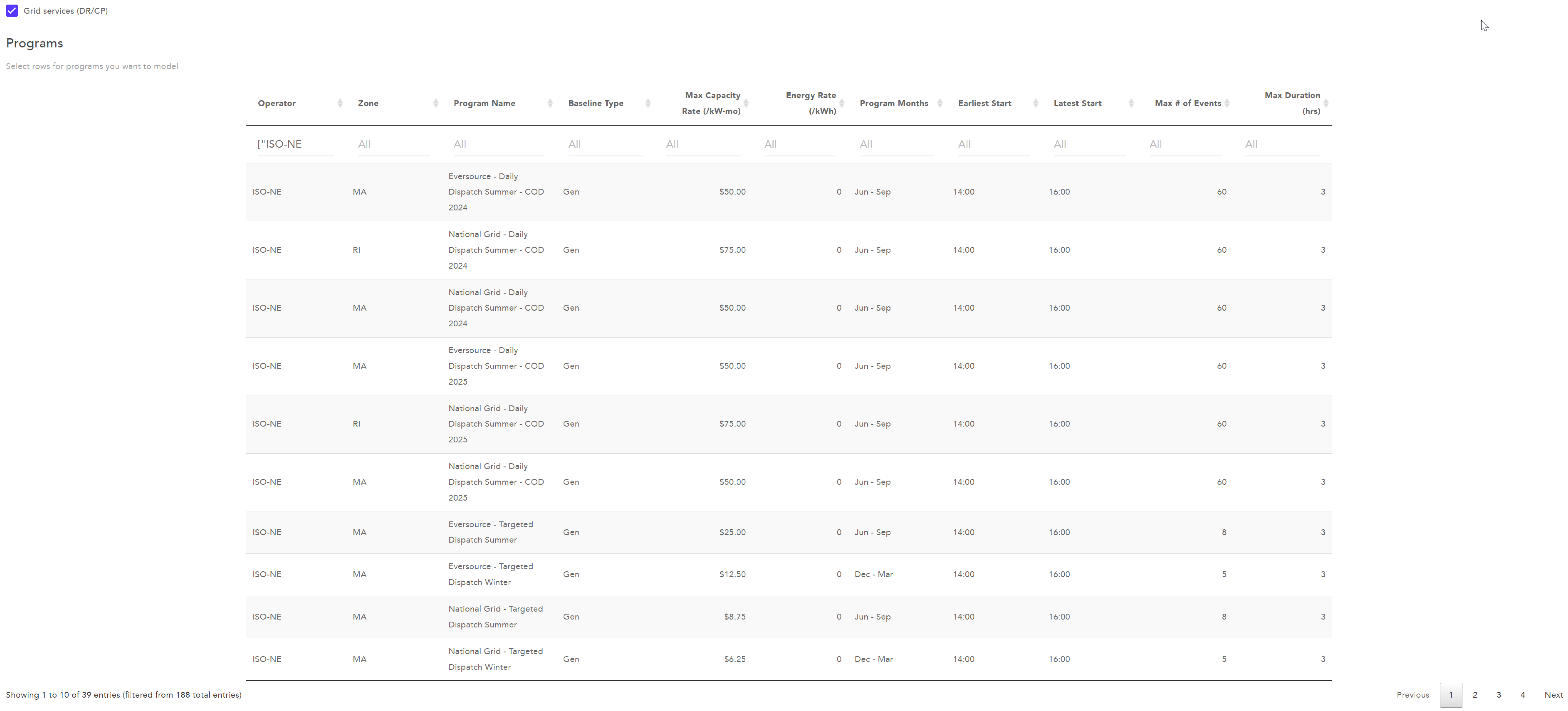
But the feature's complexity created real friction: engineers struggled with limited visibility into selected programs, faced a steep learning curve navigating the system, and were overwhelmed by information overload from program listings.
But the feature's complexity created real friction: engineers struggled with limited visibility into selected programs, faced a steep learning curve navigating the system, and were overwhelmed by information overload from program listings.
The Solution
We redesigned Grid Services to make program selection more intuitive and efficient, reducing the friction that came with the original UI's dense tables and scattered settings.
By simplifying how programs are displayed, organized, and configured, we created a more enjoyable, streamlined experience that helps engineers communicate Enel X's electric supply offerings to clients with greater confidence.
By simplifying how programs are displayed, organized, and configured, we created a more enjoyable, streamlined experience that helps engineers communicate Enel X's electric supply offerings to clients with greater confidence.
Duration
4 Months (Mar - Jun 2023)
Role
UX Designer
UX Tester & Facilitator
UX Tester & Facilitator
Client
Enel X

Background
Painpoints

Lack of visibility for selected programs

Steep learning curve and navigation challenges

Information overload from program listings
Original UI
User Selects their
Desired Program
Original UI
List of All the Programs and Information

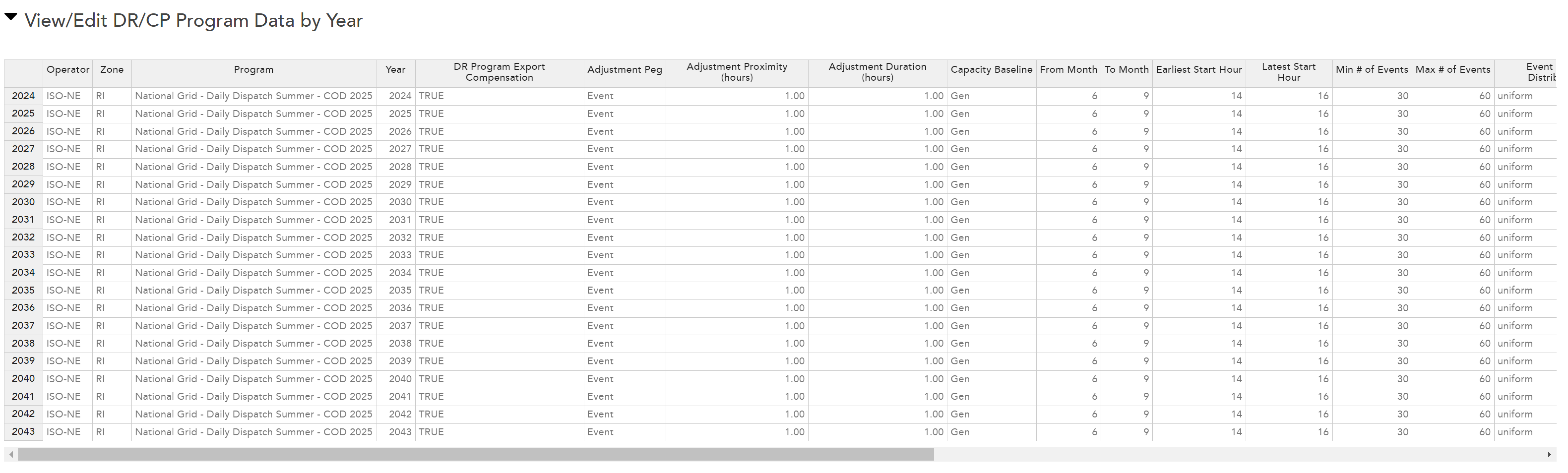
Original UI
Additional Settings
Goal
To increase the usability of Grid Services and improve the efficiency for solution engineers when selecting programs.
When solution engineers struggle with the tool, it can impact how effectively they communicate offerings to potential clients.
Improving their experience helps enable clearer, more confident client interactions.
Improving their experience helps enable clearer, more confident client interactions.
Click any image to enlarge.
Click image to view in full size.
Who we designed for
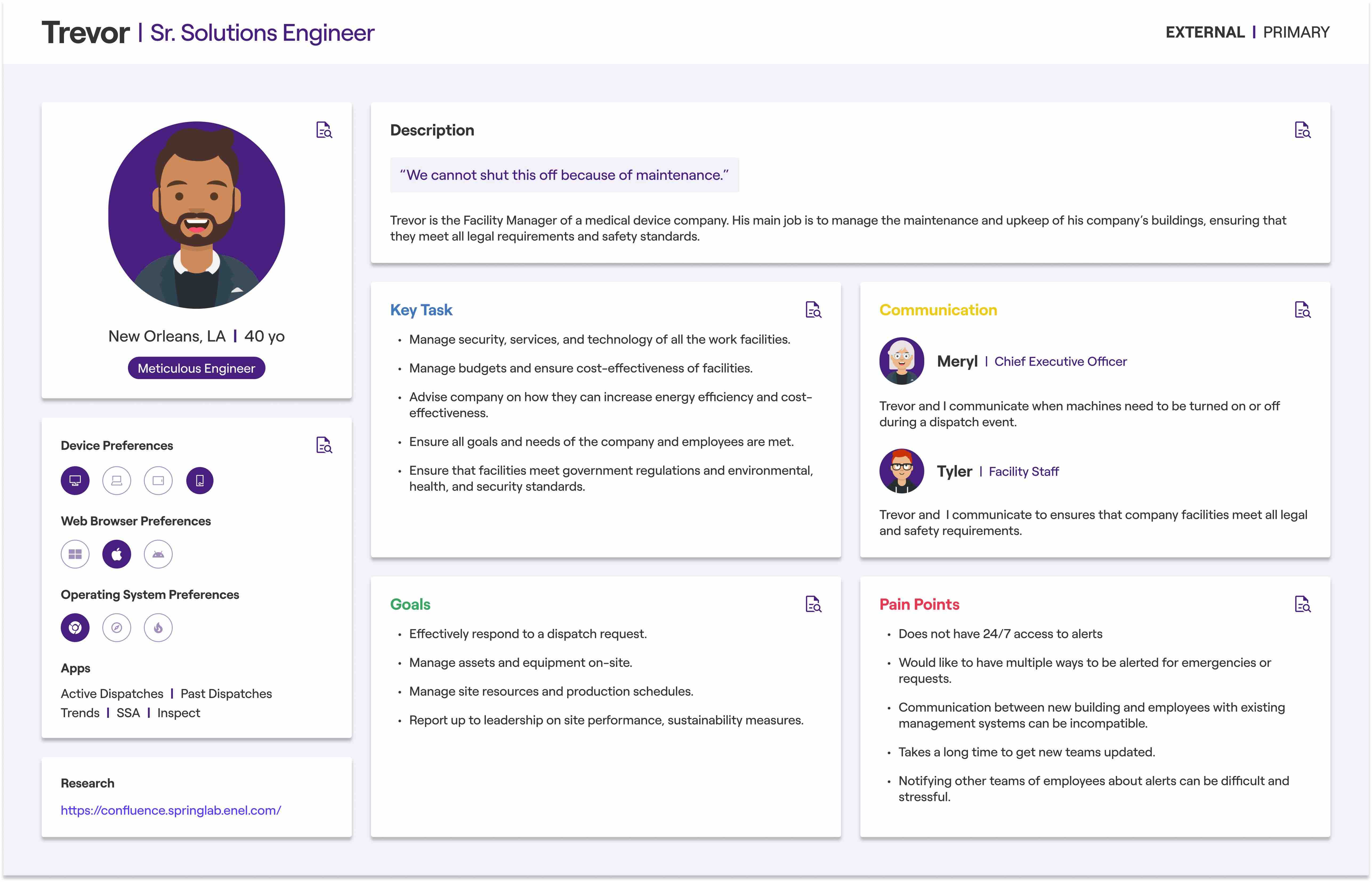
Trevor represents our core user group: solution engineers who monitor facilities and respond to operational issues in real time. His challenges around alerting, communication, and incident management became a throughline for our design decisions across the project.
The Problem
How might we
optimize the usability and enhance the efficiency of Grid Services for our Solution Engineers?
Exploring design directions
Crazy eights
I facilitated a Crazy Eights ideation session, using voting and sticky notes to prioritize ideas for development.
Concept Sketches
Project Manager
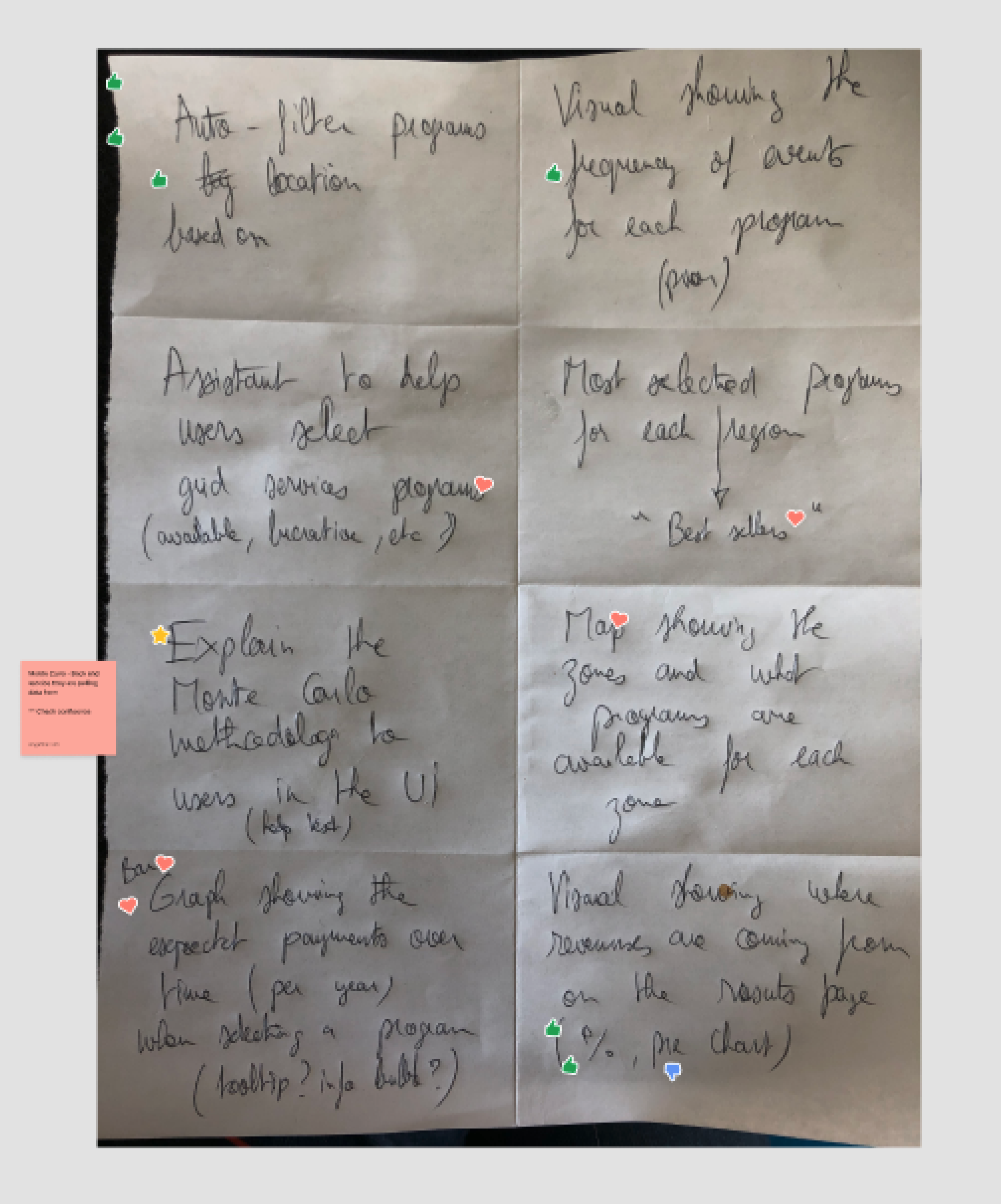
Concept Sketches
UX Designer (Me)
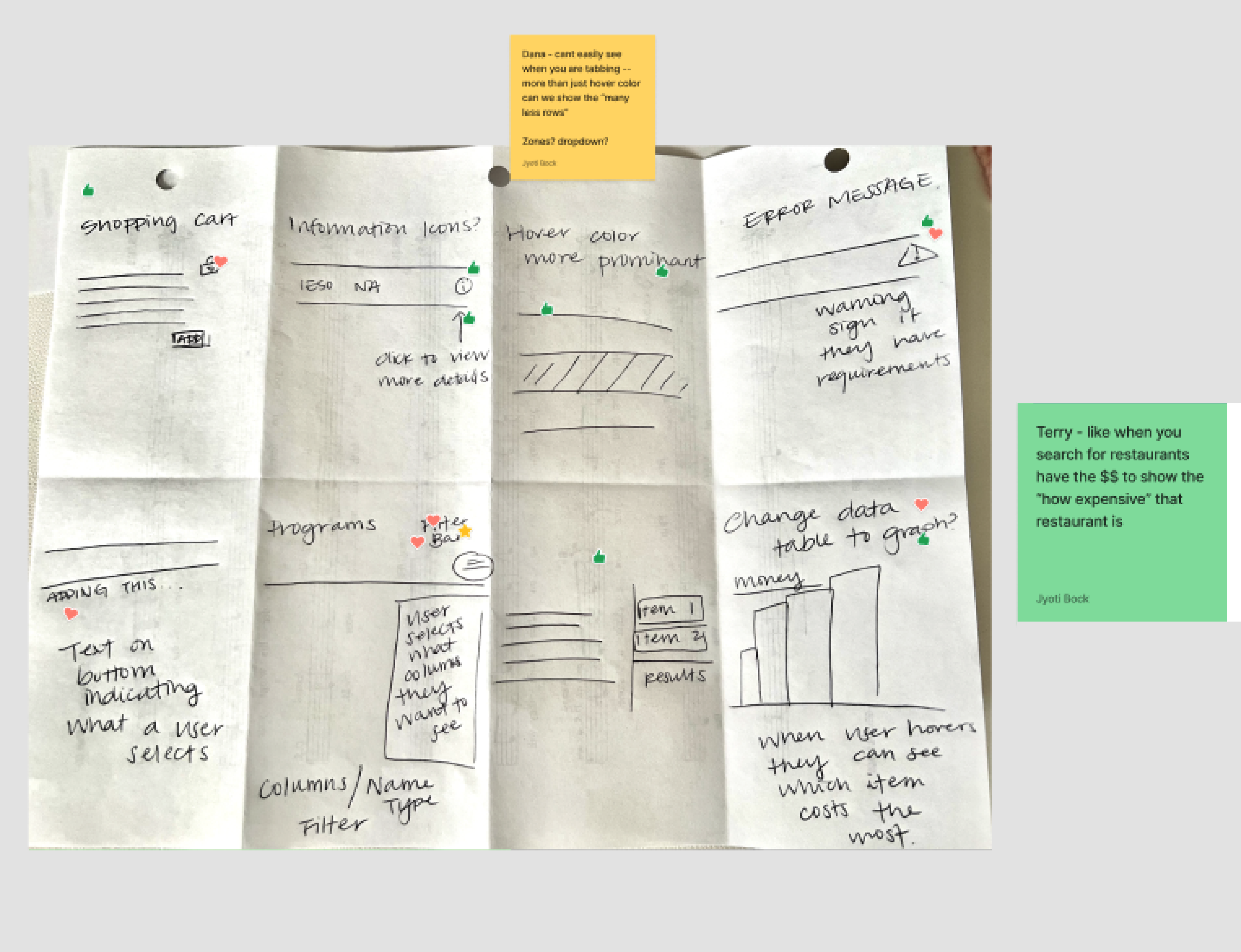
Concept Sketches
Solutions Engineer
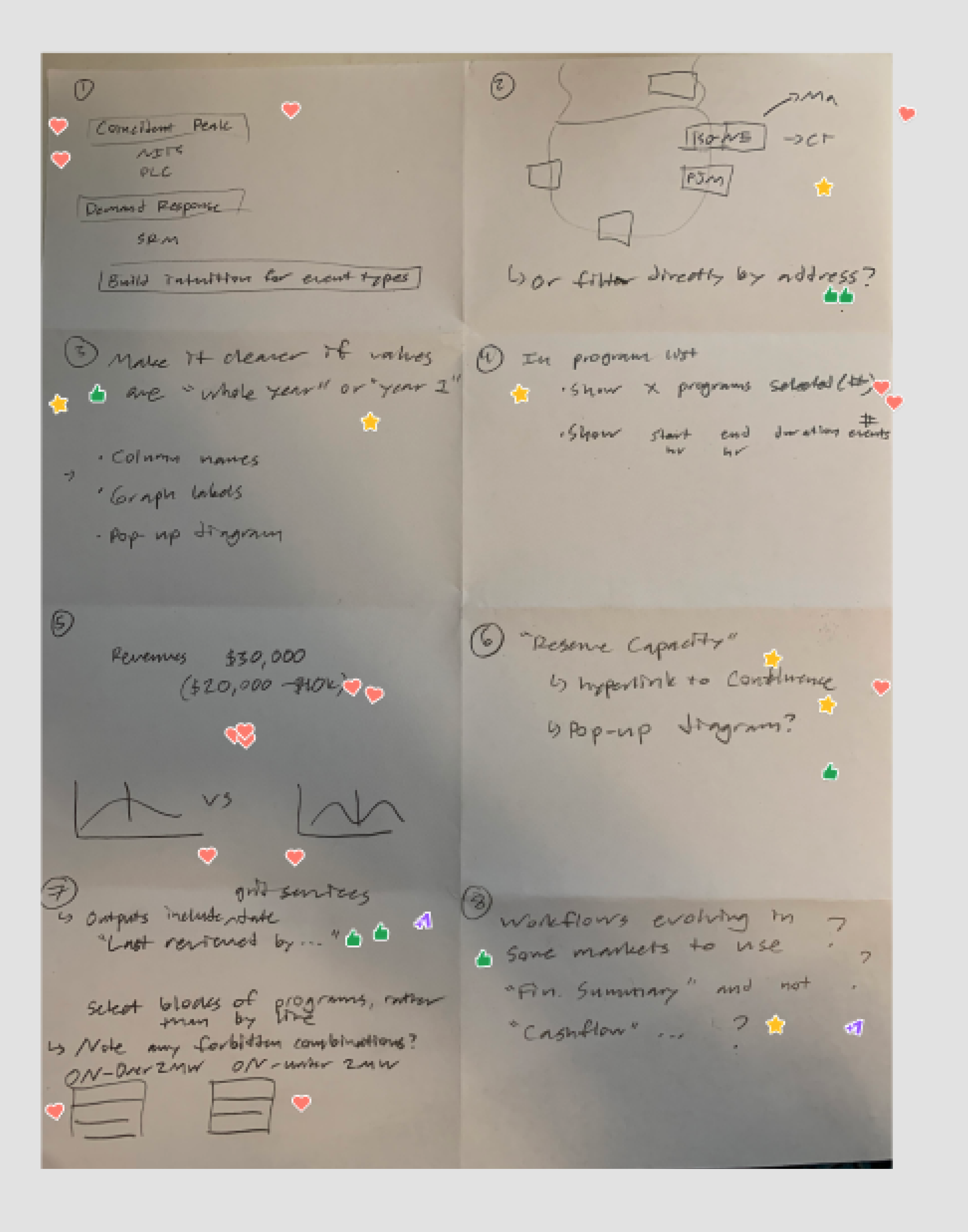
Click any sketch to enlarge.
Stakeholders

Product Manager
Represented Business Priorities
UX Designer (Me)
Facilitated the Workshop
Solution Engineer
Represented the Primary End User
Outcome

Generated 24+ concepts across three stakeholders
Prioritized the strongest ideas through team voting
Used winning concepts as the foundation for wireframes.
Facilitation Insights

the goal isn't perfect ideas...
Crazy Eights works because the time pressure doesn't leave room to second-guess. Our product manager hadn't done an exercise like this before, and felt pressured by the pace at first.
I reframed it for them: the goal isn't perfect ideas, it's volume, and often the "imperfect" ones spark the better ideas later.
I reframed it for them: the goal isn't perfect ideas, it's volume, and often the "imperfect" ones spark the better ideas later.
Customer Journey Mapping
User Journey
I created a user journey map to understand user goals, behaviors, and pain points, uncovering opportunities to improve battery selection and decision making.
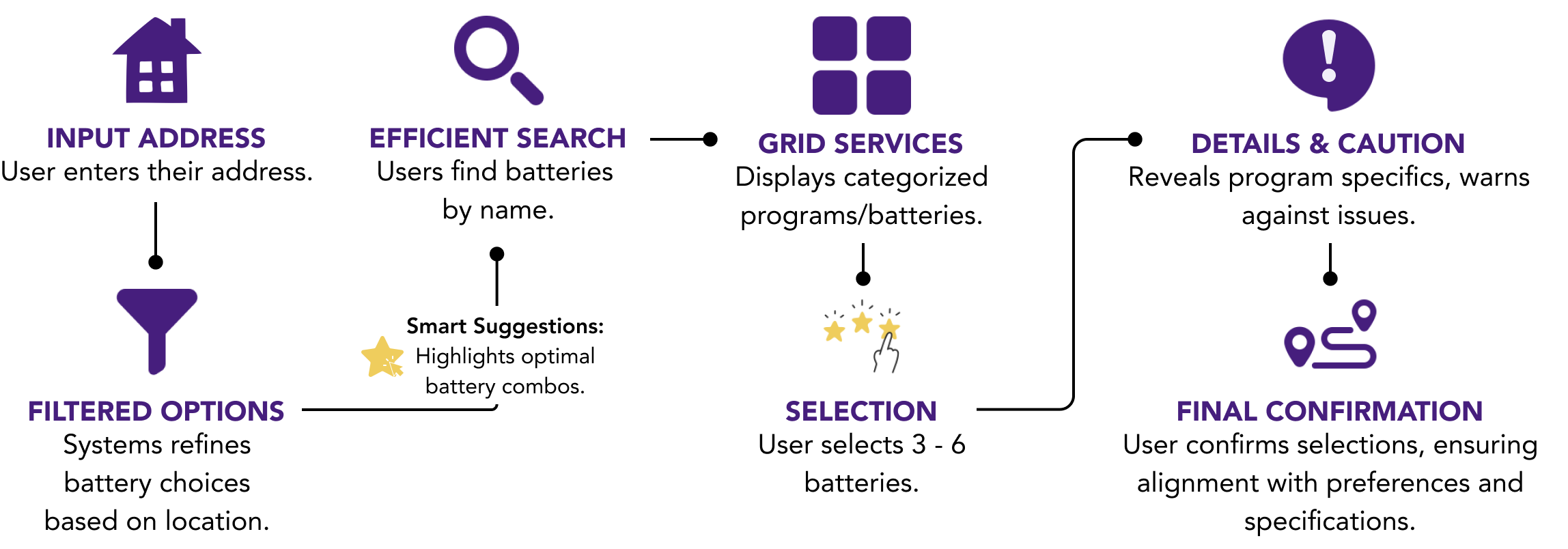
Purpose
This journey map visualized Trevor’s end-to-end workflow in Grid Services, helping us identify pain points, decision-making moments, and opportunities to improve the experience.
Mapping each step revealed key friction points during battery selection, where solution engineers lacked an easy way to compare options side by side.
Mapping each step revealed key friction points during battery selection, where solution engineers lacked an easy way to compare options side by side.
Outcome
Identified key decision points.
Exposed information gaps during comparison.
Prioritized improvements for the first wireframes.
Facilitation Insights
Before designing the future, we first needed to understand the present.
We collaborated with solution engineers to walk through their workflow step by step using the existing interface as a reference.
By identifying moments of hesitation, missing information, and trust gaps, we created a shared understanding of user needs and used these insights to guide design improvements.
By identifying moments of hesitation, missing information, and trust gaps, we created a shared understanding of user needs and used these insights to guide design improvements.
Ideation
Low-Fidelity
After our workshop, I beagan sketching multiple layout concepts.
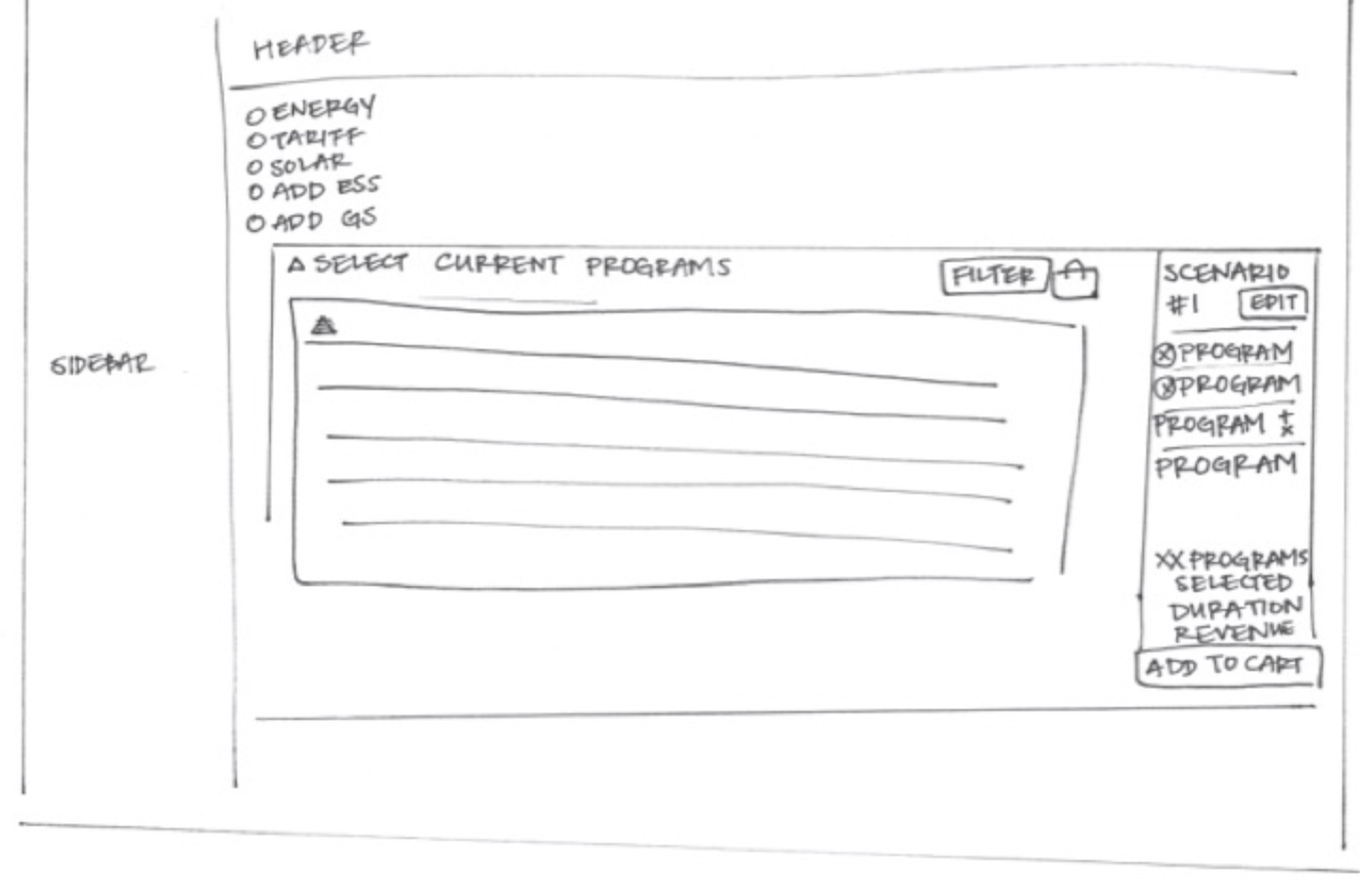
A Sketch from my Notebook that Depicts a New Layout
Key points

Checkboxes for Clear Program Selection

Cart-like Function for Tracking Programs
.png)
Filters to Condense Data
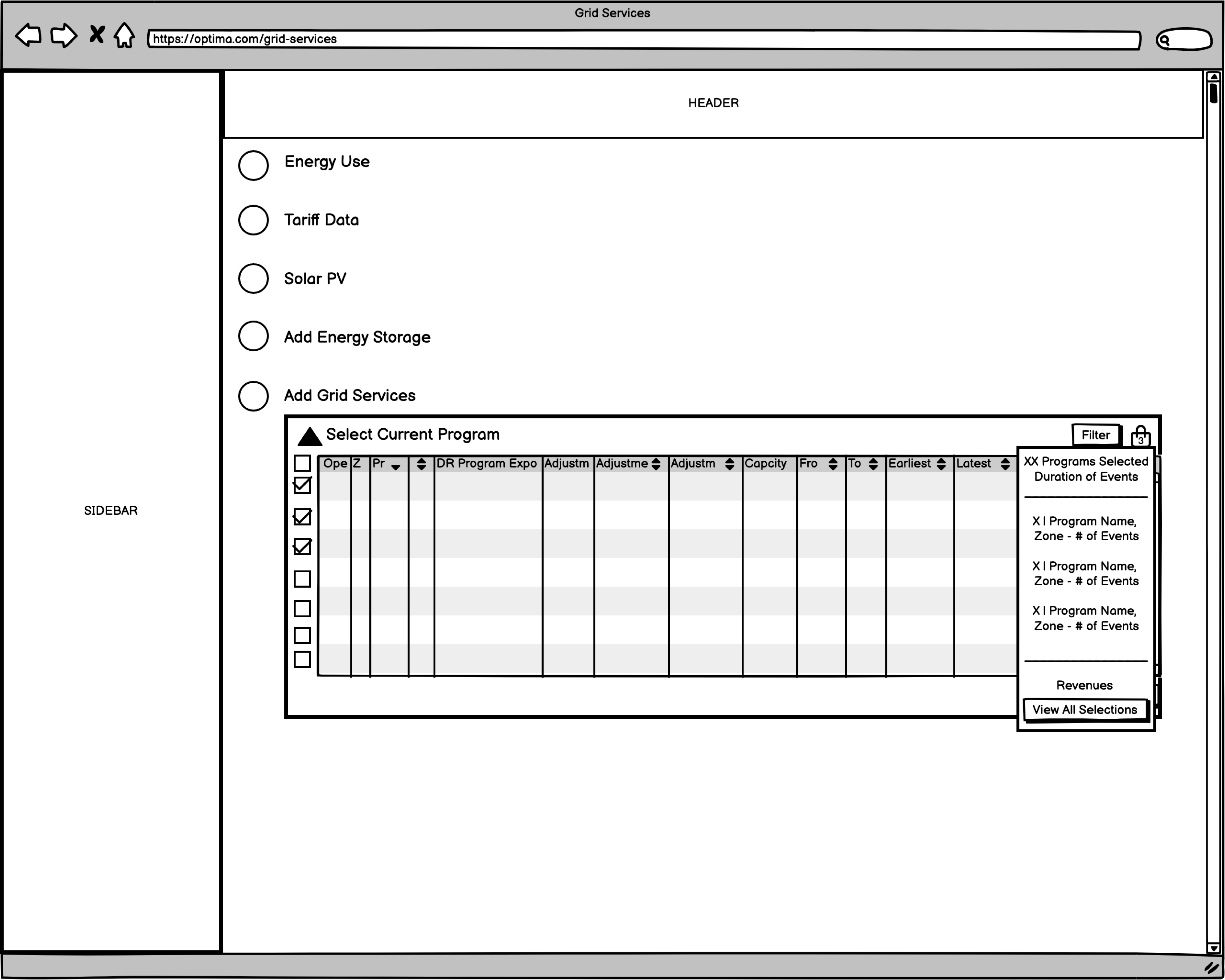
A Low-Fi Mockup from Balsamiq
of the Cart-like feature
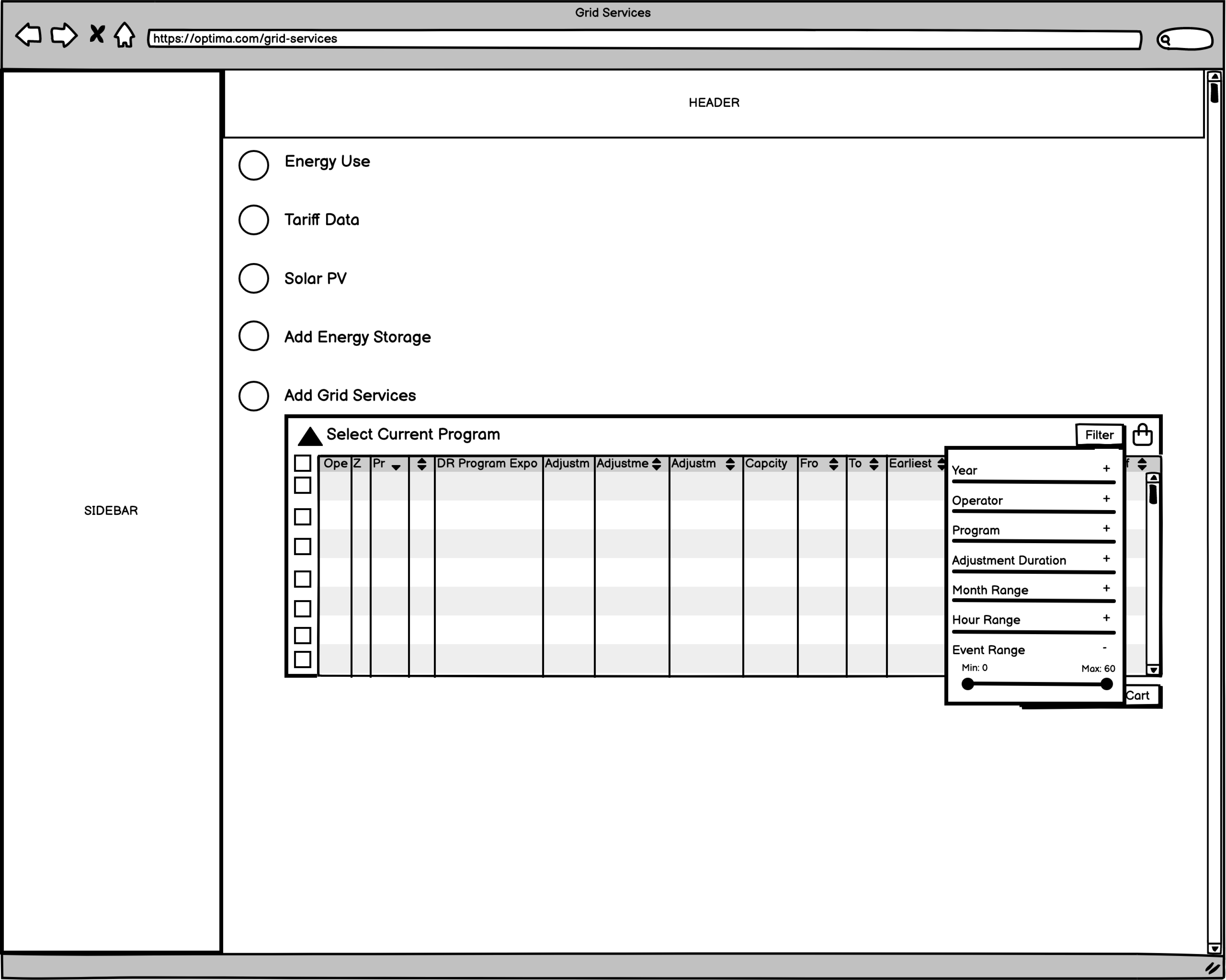
A Low-Fi Mockup from Balsamiq
of the Filter feature
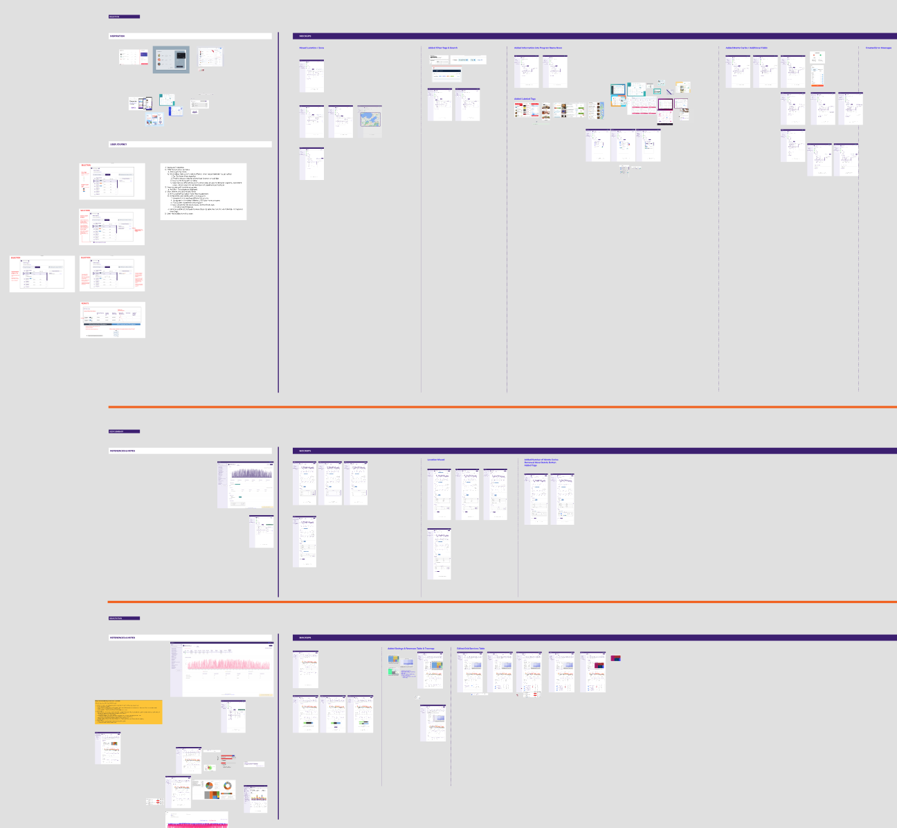
Design Refinement
After presenting multiple concepts to the Product Manager and Lead UX Designer, we selected the strongest direction to move forward.
I translated those concepts into high-fidelity mockups and organized them into categories to support comparison, discussion, and iteration.
I translated those concepts into high-fidelity mockups and organized them into categories to support comparison, discussion, and iteration.
High-Fidelity
To help stakeholders better visualize and evaluate concepts, I designed selected ideas into high-fidelity mockups earlier than my typical process.
This enabled more meaningful feedback and increased confidence in design decisions.
This enabled more meaningful feedback and increased confidence in design decisions.
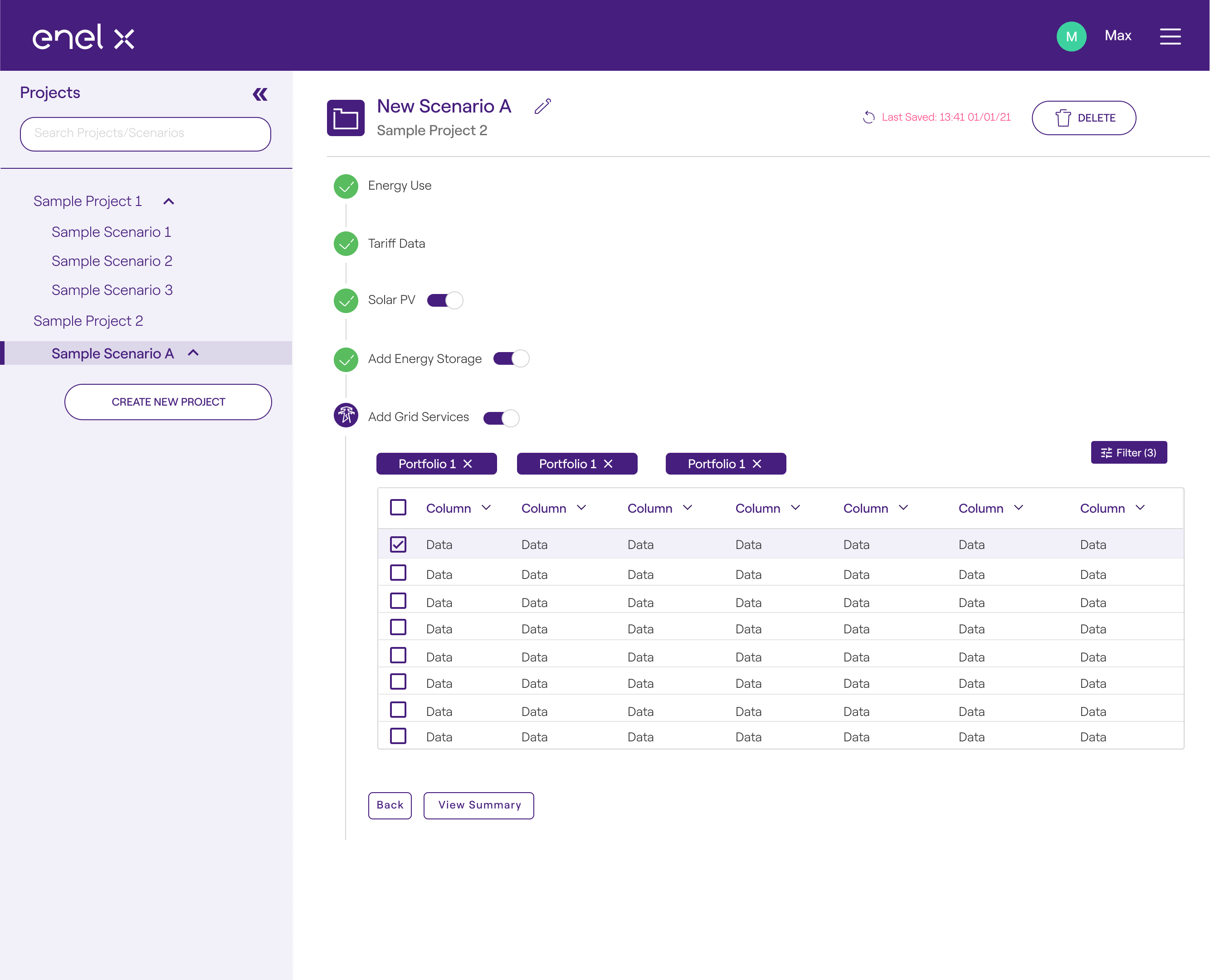
Collapsible Filtering
Enable users to customize the information displayed for their program through a collapsible filter
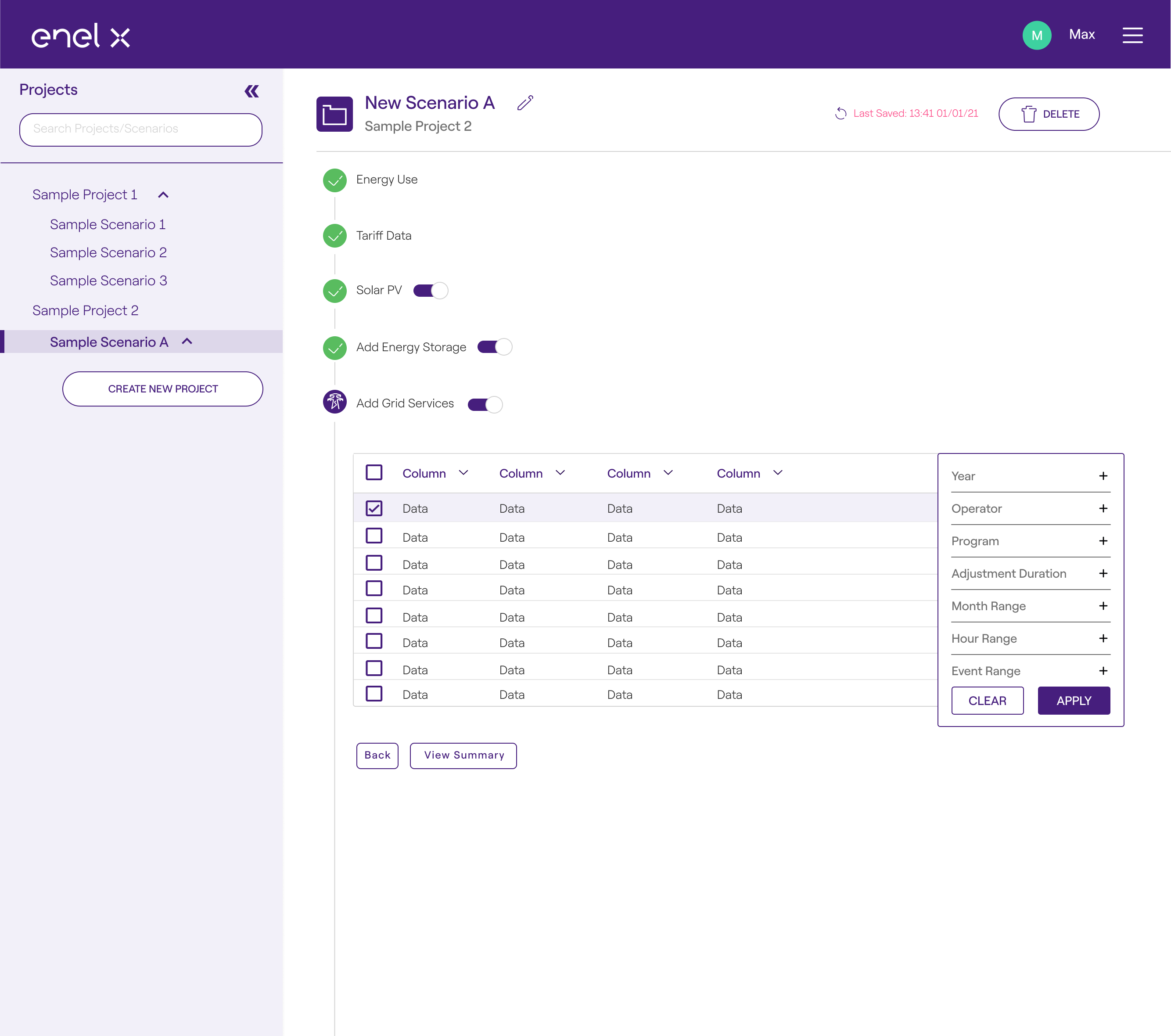
Static filter setting
Enable users to customize the information displayed for their program through a filter always present on the right side
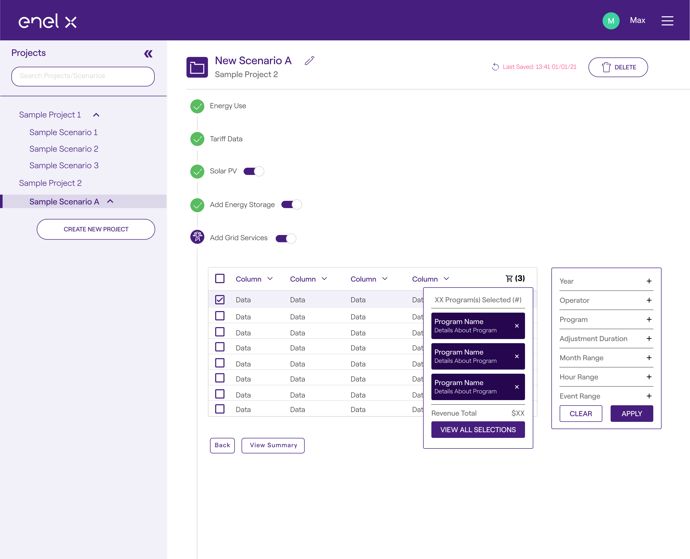
Filter & CART
Provide users with the ability to easily view their chosen programs and conveniently apply filters to their options
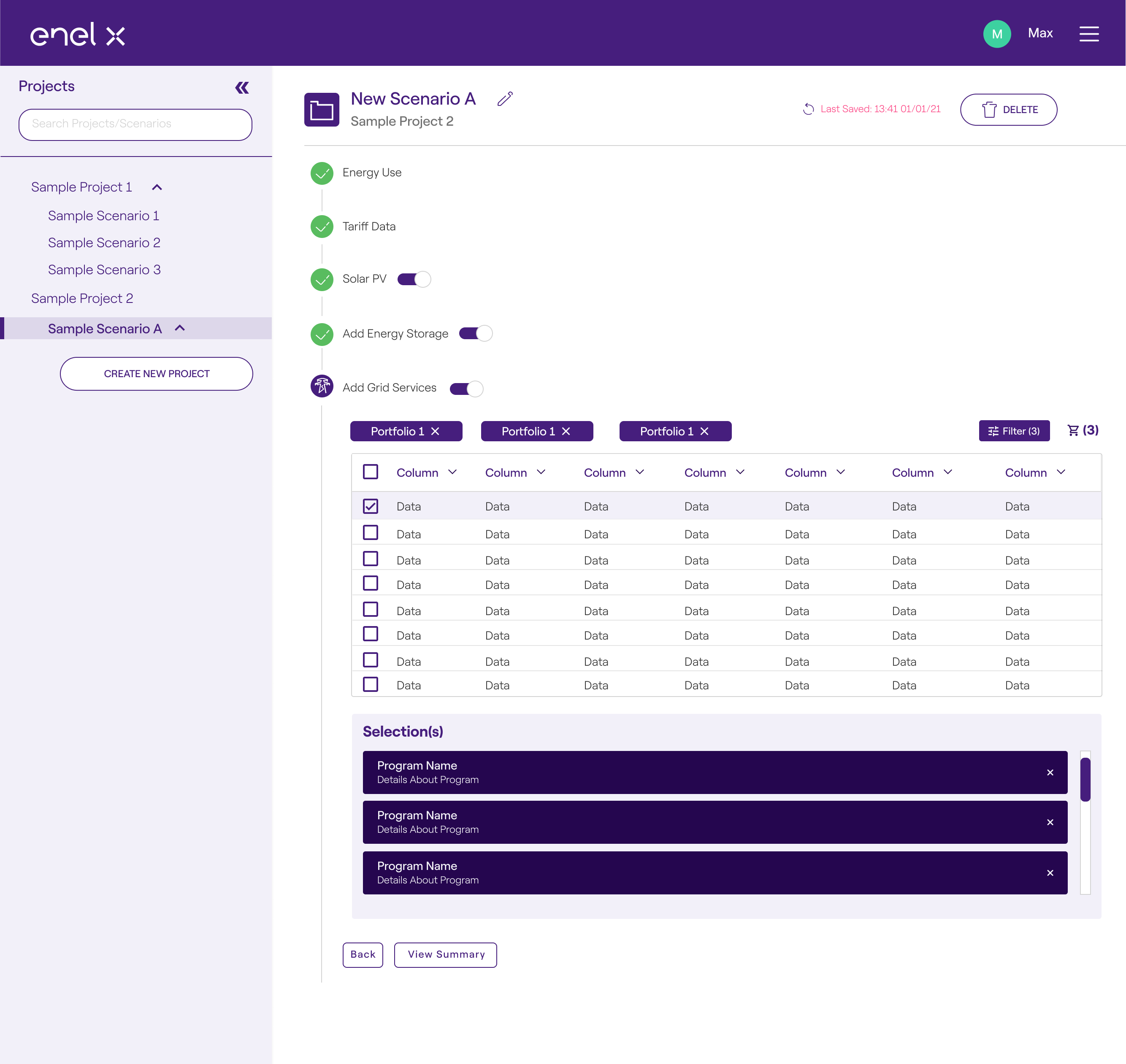
Cart Organization
Here are various organizational options for users to view their selected programs
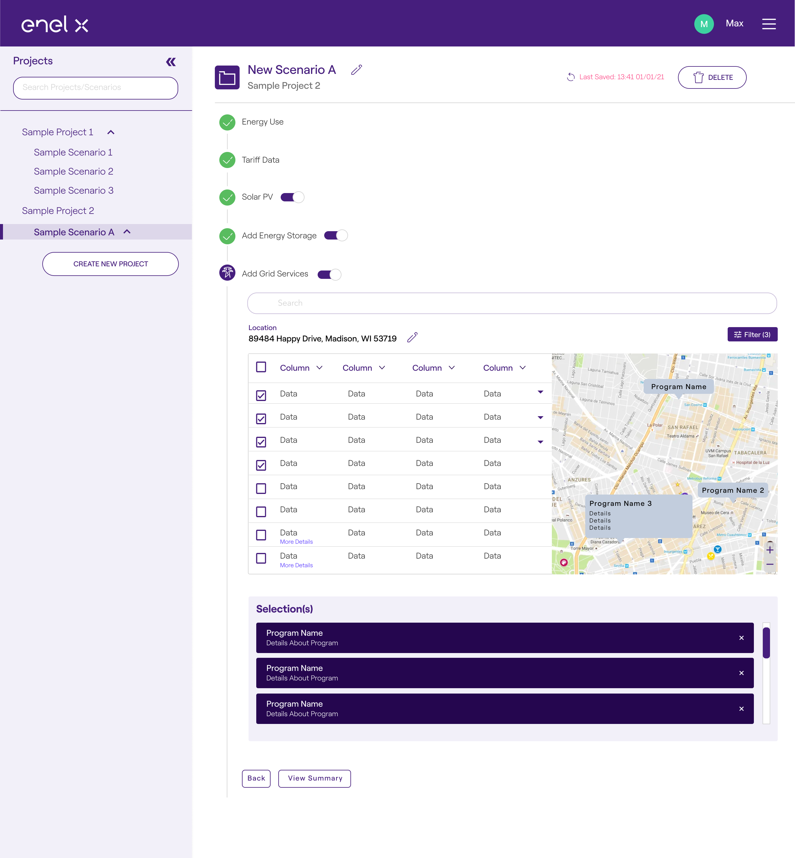
Table with map
Allow users to reference a map of the program location on the right side for easy reference
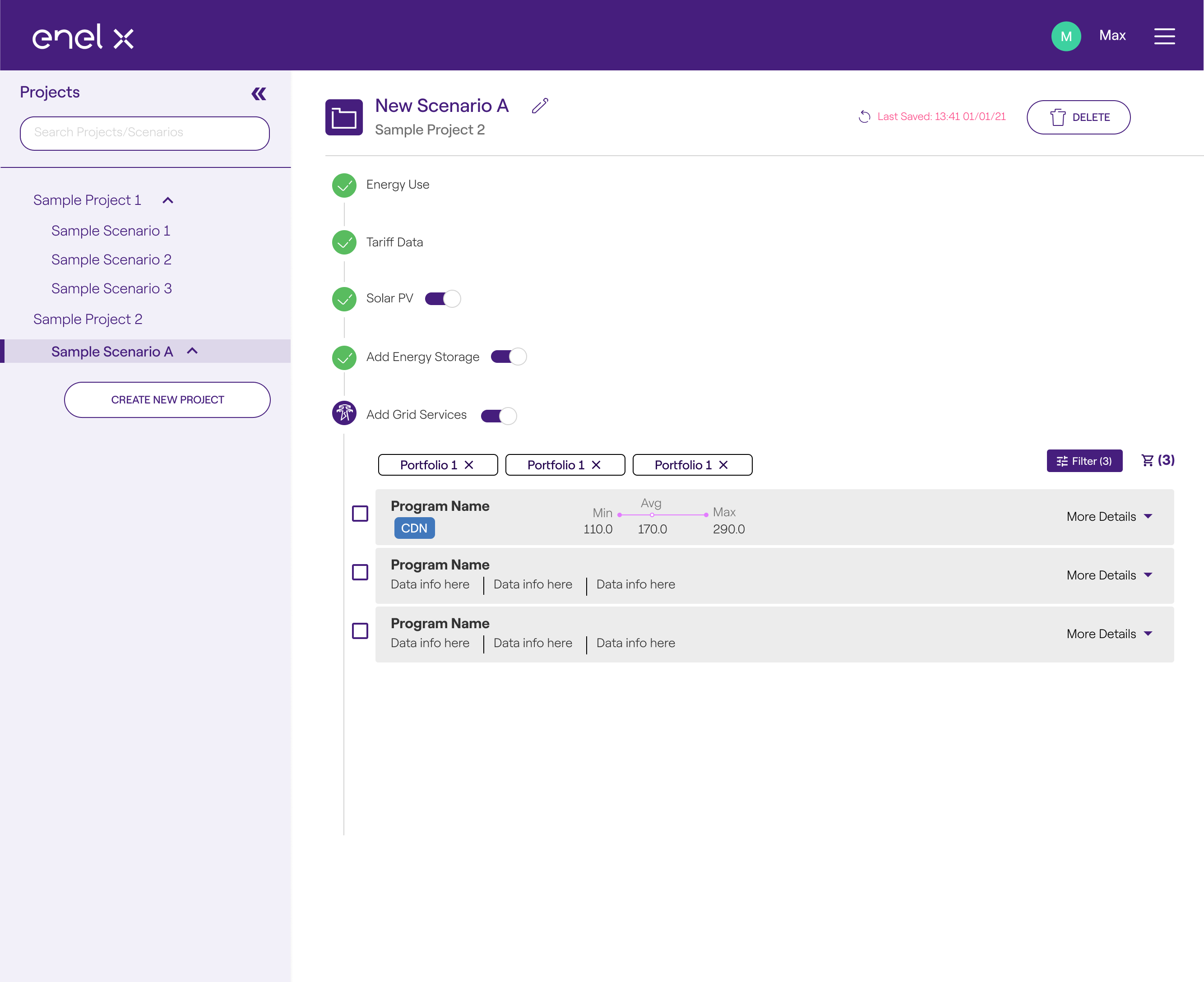
Table Organization
Here are various organizational options for users to see their filtered information
Click any mockup to enlarge.
Design Validation
Feedback workshop
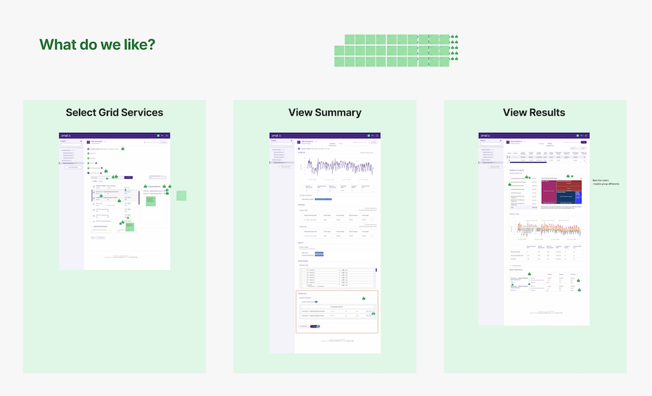
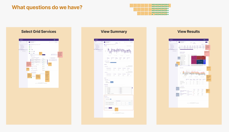
I facilitated a workshop with developers after the initial design iteration to evaluate feasibility, uncover technical constraints, and inform design refinements.
Feedback to:
What do we like?
Feedback to:
What questions do we have?
Feedback to:
What ideas sparked?
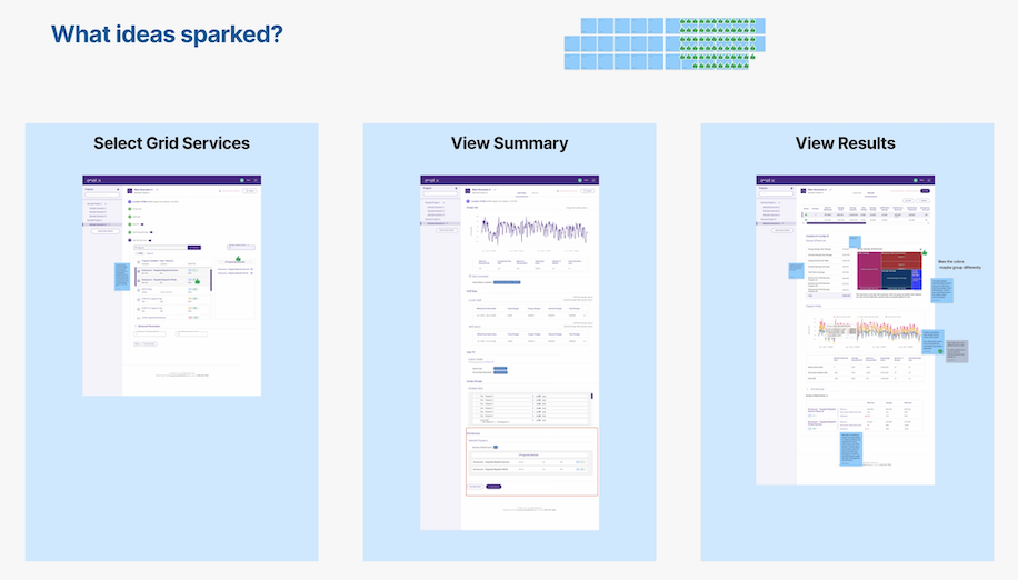
Click any feedback to enlarge.
Stakeholders
Software Developers
Provided technical expertise to evaluate design feasibility, identify implementation constraints, and surface opportunities for improving the proposed solutions.
Engineering Partners
Helped translate design concepts into actionable requirements by sharing technical considerations, dependencies, and potential tradeoffs.
Product/Design Team
Collaborated with developers to align user experience goals with technical realities and prioritize solutions that balanced user needs and feasibility.
Outcome
Identified technical constraints before implementation.
Refined concepts based on developer feedback.
Increased confidence that proposed solutions were feasible.
Facilitation Insights
The goal wasn’t to validate perfect solutions, it was to uncover what was possible together.
To encourage open and actionable feedback, we structured the workshop around three prompts: What do we like? What questions do we have? What ideas did this spark?
This framework created space for developers to share technical considerations while also exploring opportunities for improving the user experience. The discussion helped bridge the gap between design intent and implementation feasibility.
This framework created space for developers to share technical considerations while also exploring opportunities for improving the user experience. The discussion helped bridge the gap between design intent and implementation feasibility.
Prototype Development
First Prototype
After exploring multiple concepts, we narrowed our ideas into three design directions that best addressed the solution engineer’s workflow and comparison needs.
Key Ideas
Hybrid Approach Combining Checkboxes with Visual Selection Indicators
Static Shopping Cart
Collapsible Filtering
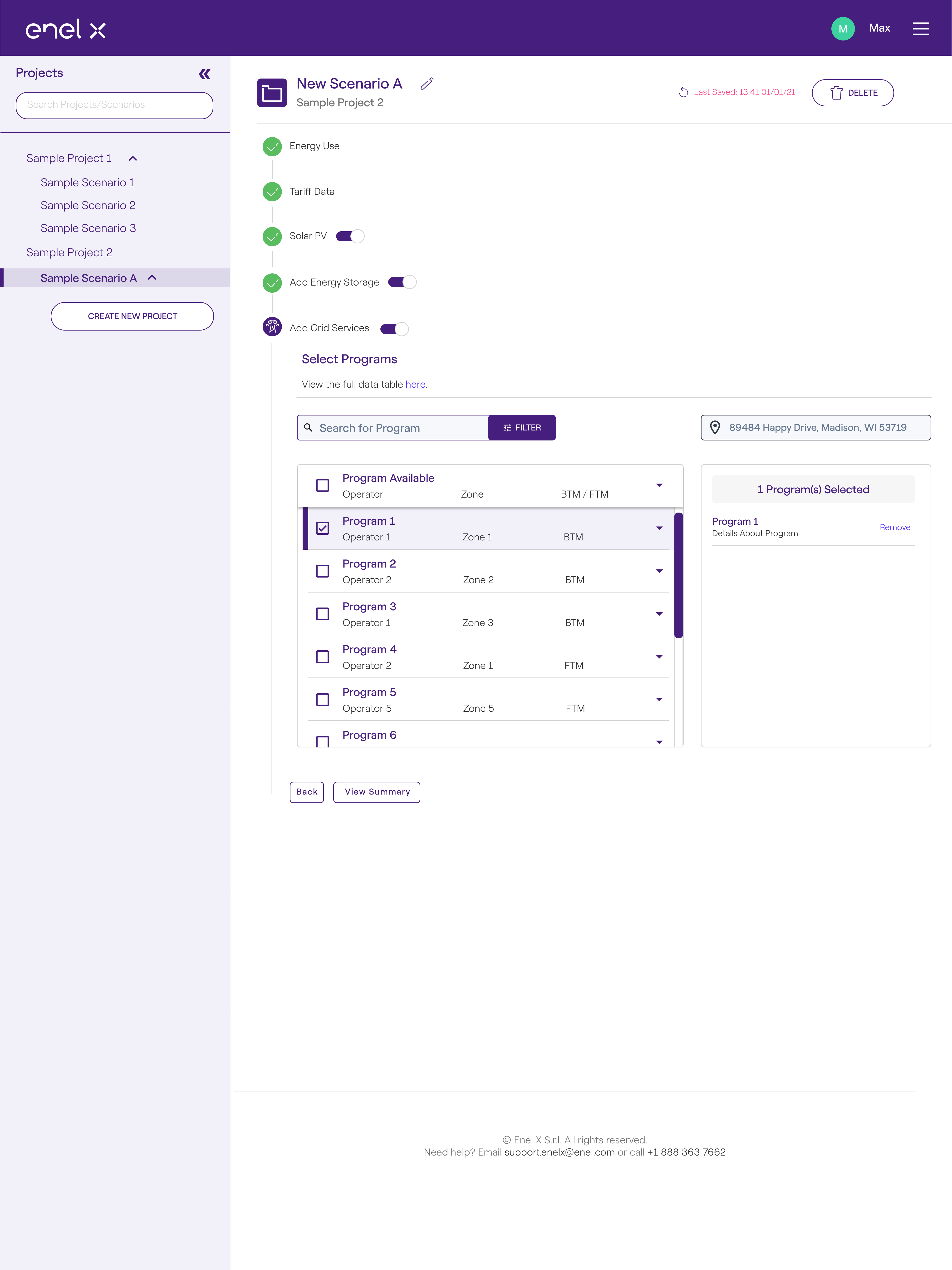
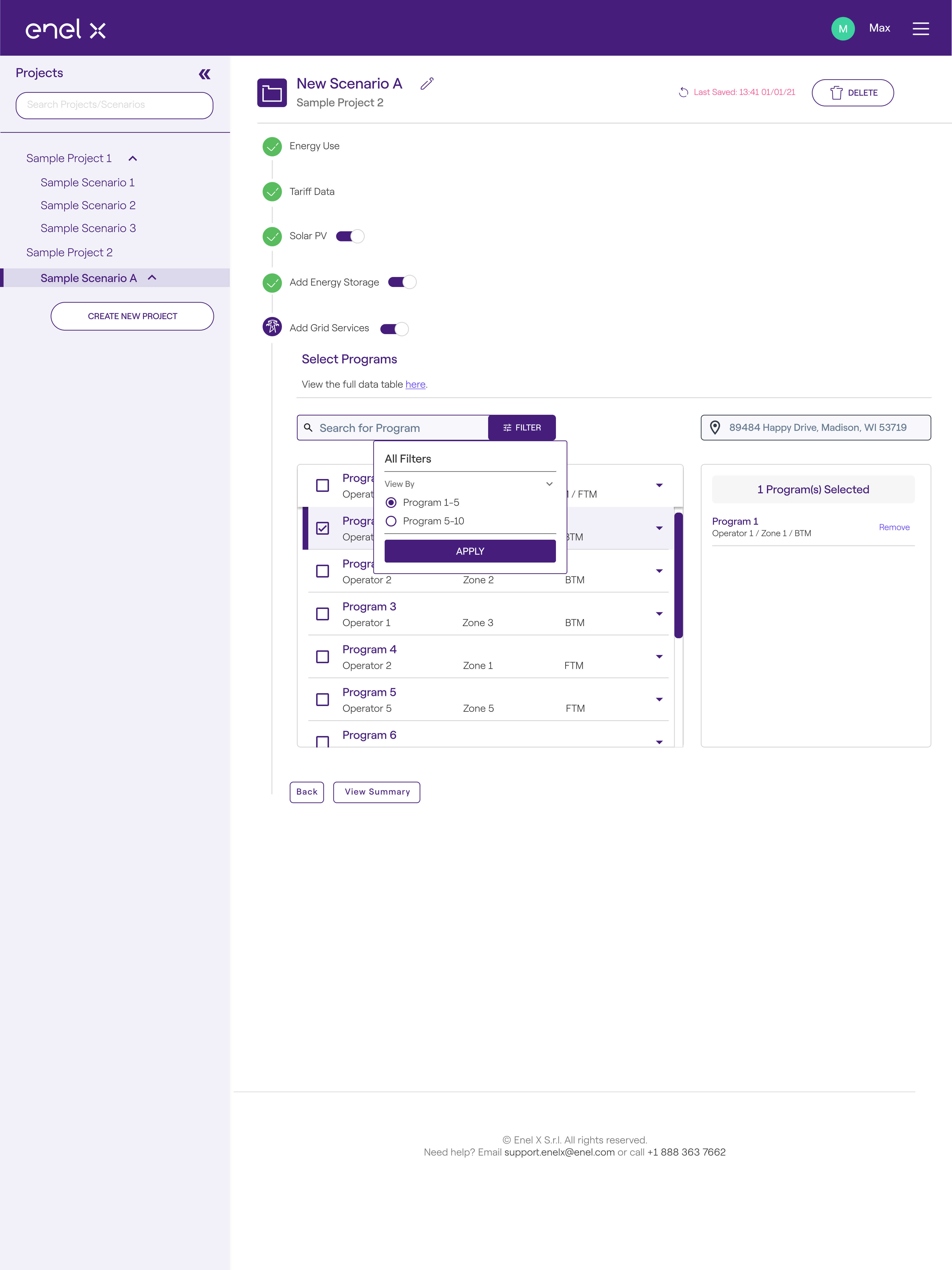
Click any mockup to enlarge.
Narrowing the design direction
Based on insights from the solution engineer’s user journey and feedback from the Product Manager, we narrowed our concepts down to three design directions as seen above.
Each direction addressed Trevor’s primary need: efficiently comparing battery options to make cost-effective decisions for his facilities.
We built the initial prototype for desktop, where the majority of Grid Services selections take place, allowing us to focus on optimizing the experience for the primary use case.
Each direction addressed Trevor’s primary need: efficiently comparing battery options to make cost-effective decisions for his facilities.
We built the initial prototype for desktop, where the majority of Grid Services selections take place, allowing us to focus on optimizing the experience for the primary use case.
Usability
User Testing
User testing with internal solution engineers helped validate design decisions and uncover opportunities to improve workflow efficiency.


.png)
What's the value of the program?
What's the range?
What type of program is selected.
That's what I want to know.
Interviewee #1
Internal Solution's Engineer
Stakeholders
3 Internal Solution Engineers
Participated in usability testing to validate workflows, identify usability challenges, and provide feedback based on real-world product expertise.
Outcome
Validated the overall interaction model.
Identified three high-priority usability improvements.
(View in User Findings section below.)
(View in User Findings section below.)
Guided the next design iteration before handoff.
User Findings
User testing revealed three key opportunities for refinement:
improving the filtering experience,
adding value indicators,
and introducing program type tags
to support faster decision-making.
improving the filtering experience,
adding value indicators,
and introducing program type tags
to support faster decision-making.
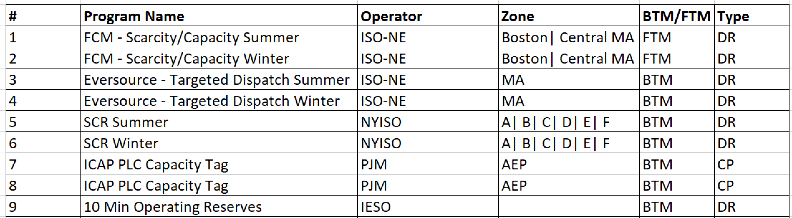
Refining the Filters
As seen in the data table headers, users want to see the headers as filter options.
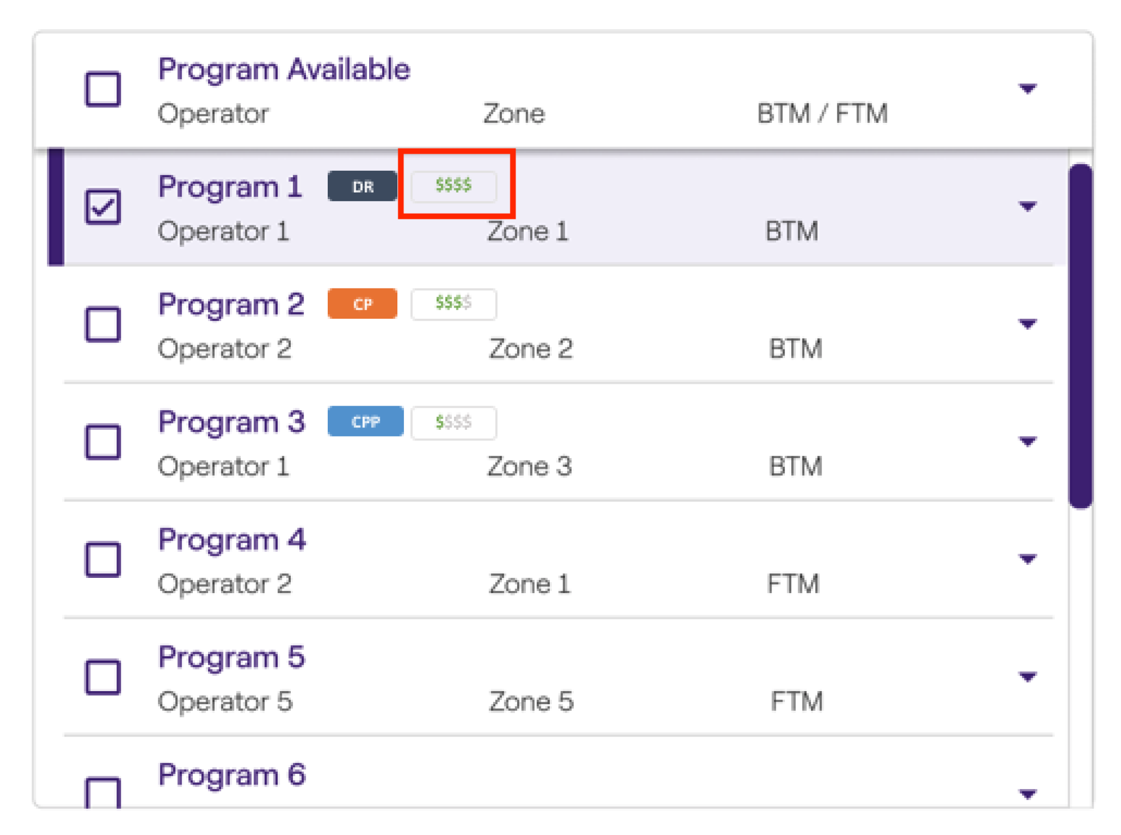
Adding Value Tags
Just like the dollar sign ratings on Yelp that indicate the cost of a meal, users want a similar design for our solar batteries. They wanted to know whether a battery is more affordable or pricier compared to others.
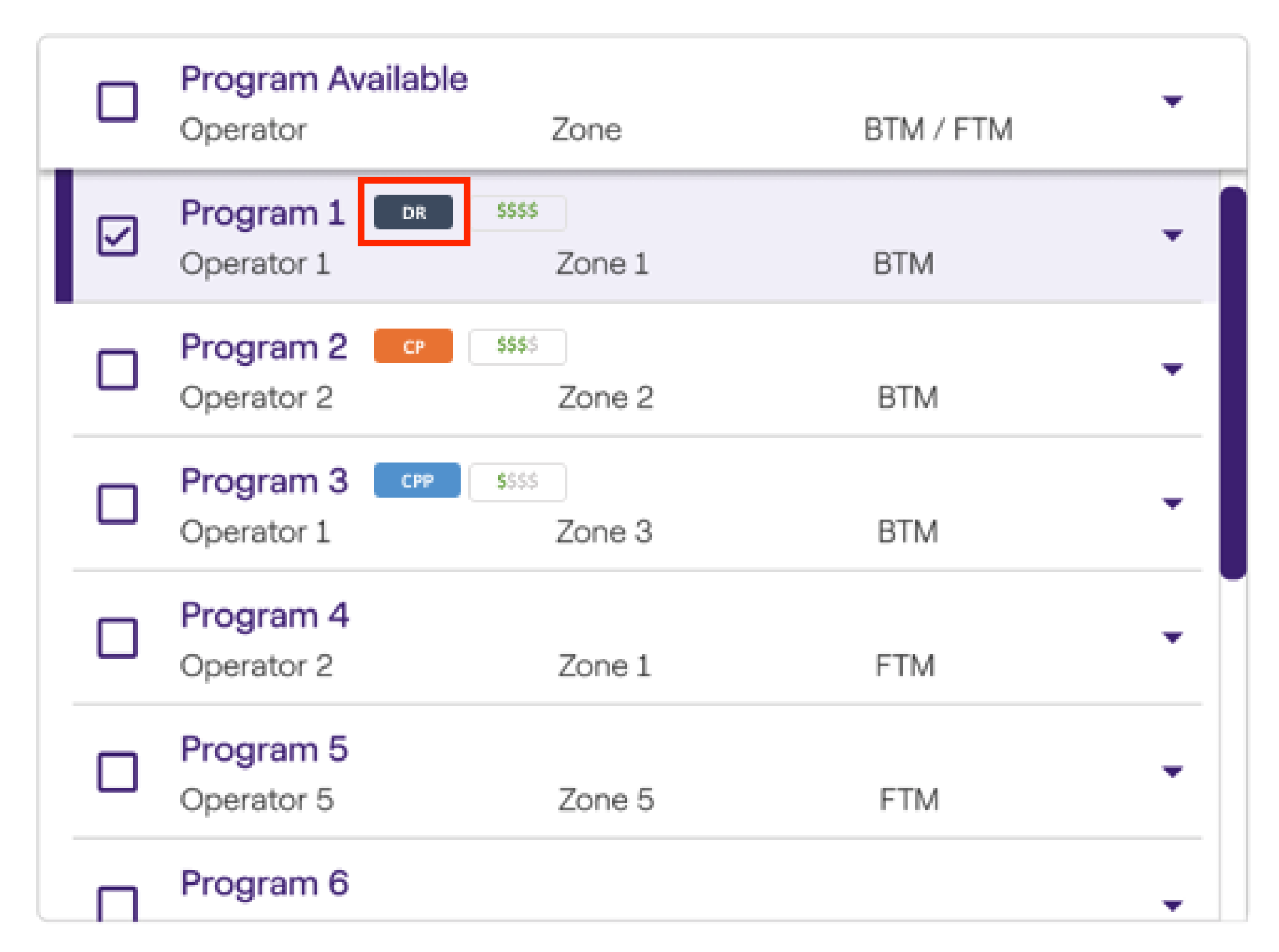
Adding Program Type Tags
Users also wanted to know what program type a battery belonged to, so they could quickly identify which category it fell into.
Click any image to enlarge.
Final Design
Final Prototype
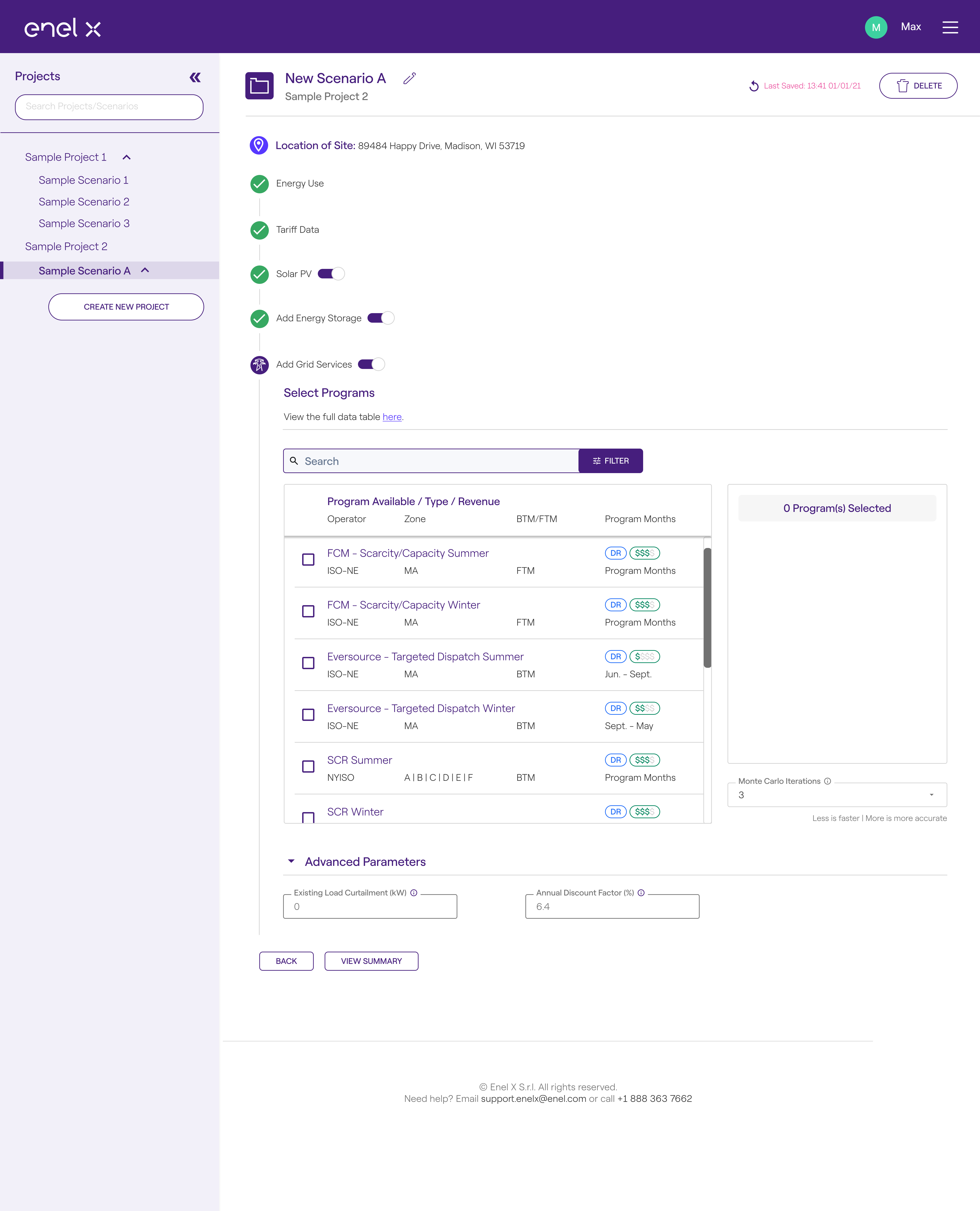
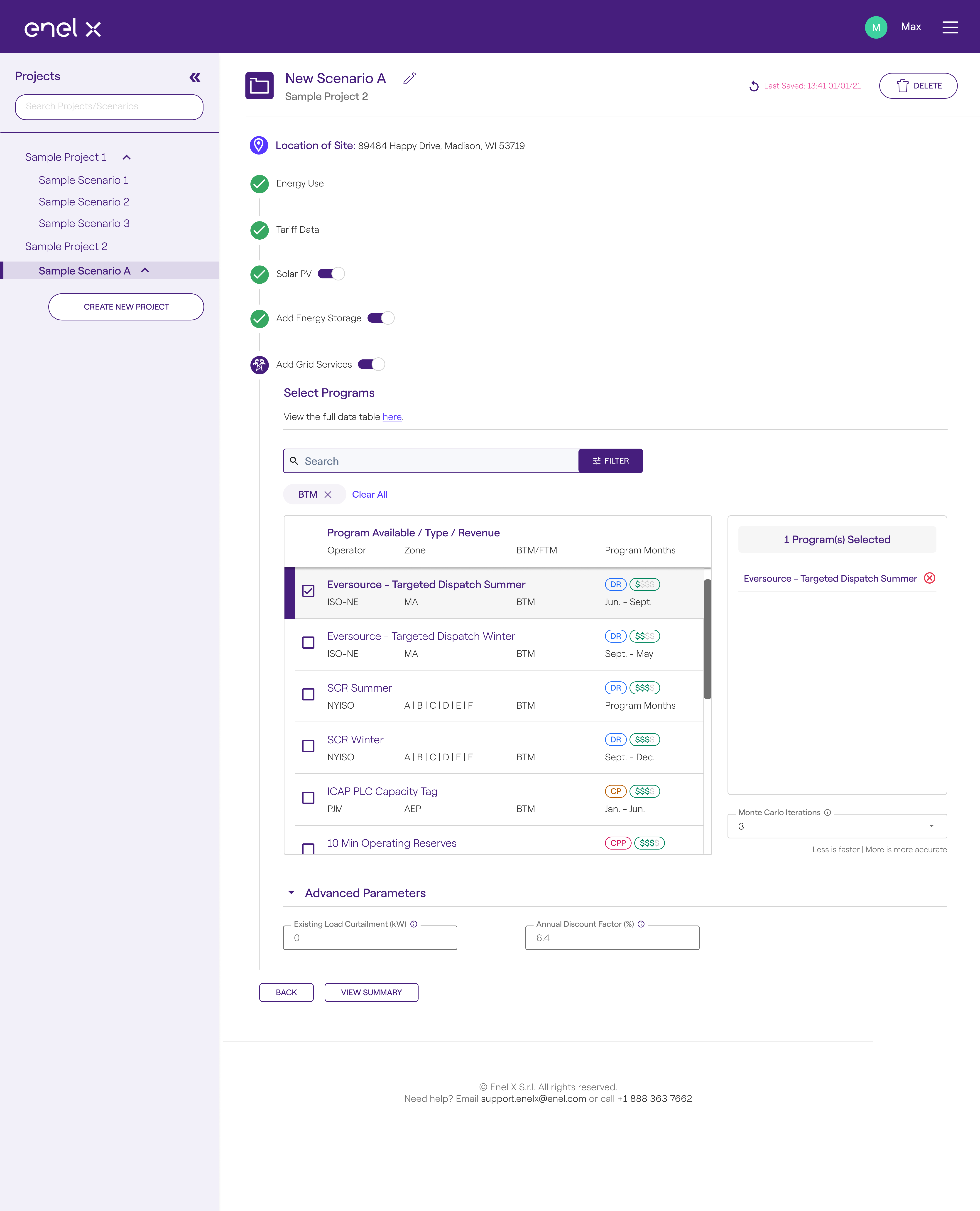
Designed an intuitive grid program selection experience that reduced cognitive load while making key program information easy to scan and compare.
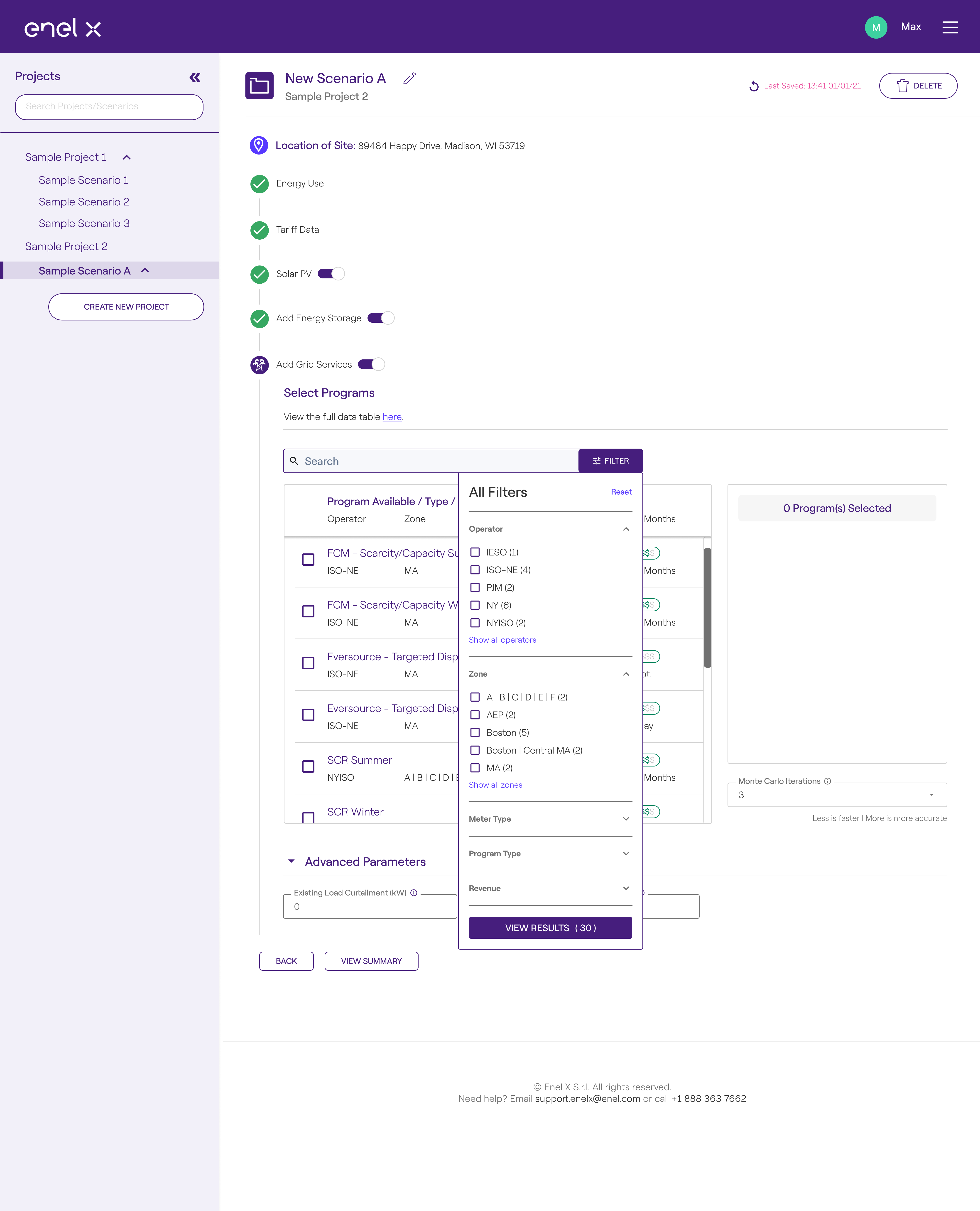
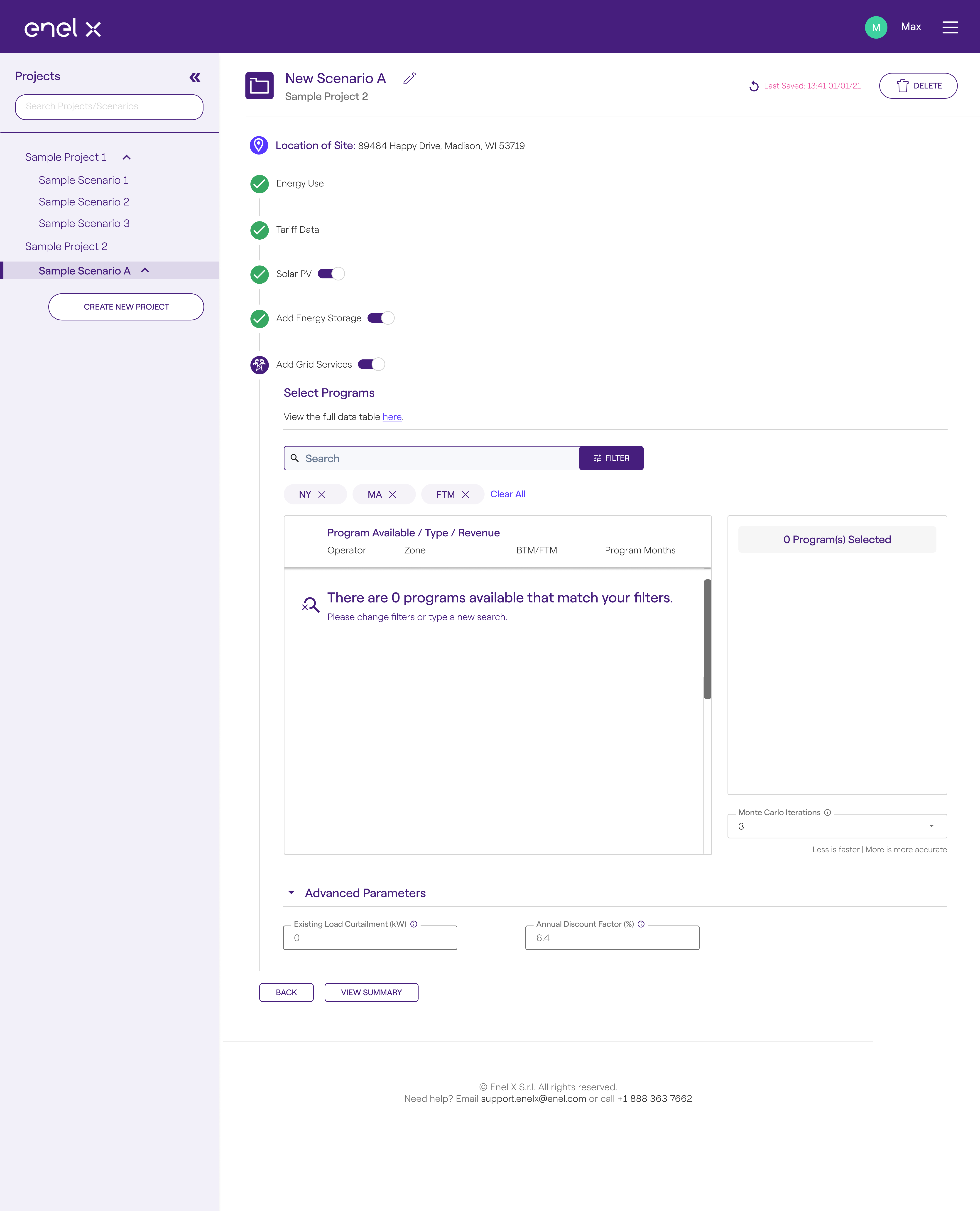
Click any mockup to enlarge.
design summary
The challenge was showing enough program information without overwhelming the user.
I pulled the key data points from the table into the filters, then added color-coded tags for program value and type so users could scan at a glance.
Selected filters now appear as tags with a one-click option to clear them all. When a user picks a program, it moves to the right side of the screen, similar to items collecting in a shopping cart.
Selecting a program also triggers a checkbox, a purple sidebar, and a background color change, so it's obvious what's been chosen.
I pulled the key data points from the table into the filters, then added color-coded tags for program value and type so users could scan at a glance.
Selected filters now appear as tags with a one-click option to clear them all. When a user picks a program, it moves to the right side of the screen, similar to items collecting in a shopping cart.
Selecting a program also triggers a checkbox, a purple sidebar, and a background color change, so it's obvious what's been chosen.
Handoff
Responsive design
As part of the final developer handoff, I refined the designs for responsive layouts across 1920px, 1440px, 1280px, and 768px to ensure a seamless experience on every screen size.
.png)
768px
.png)
1280px (Standard)
.png)
1440px
Design specifications
We provided a comprehensive design specification that outlined precise ratios and pixel values for the spatial relationships between different elements within the interface.
.png)
1440px
.png)
1280px (Standard)
.png)
768px
Use cases
Designed comprehensive use case flows to ensure the experience remained intuitive across both common and edge-case scenarios.
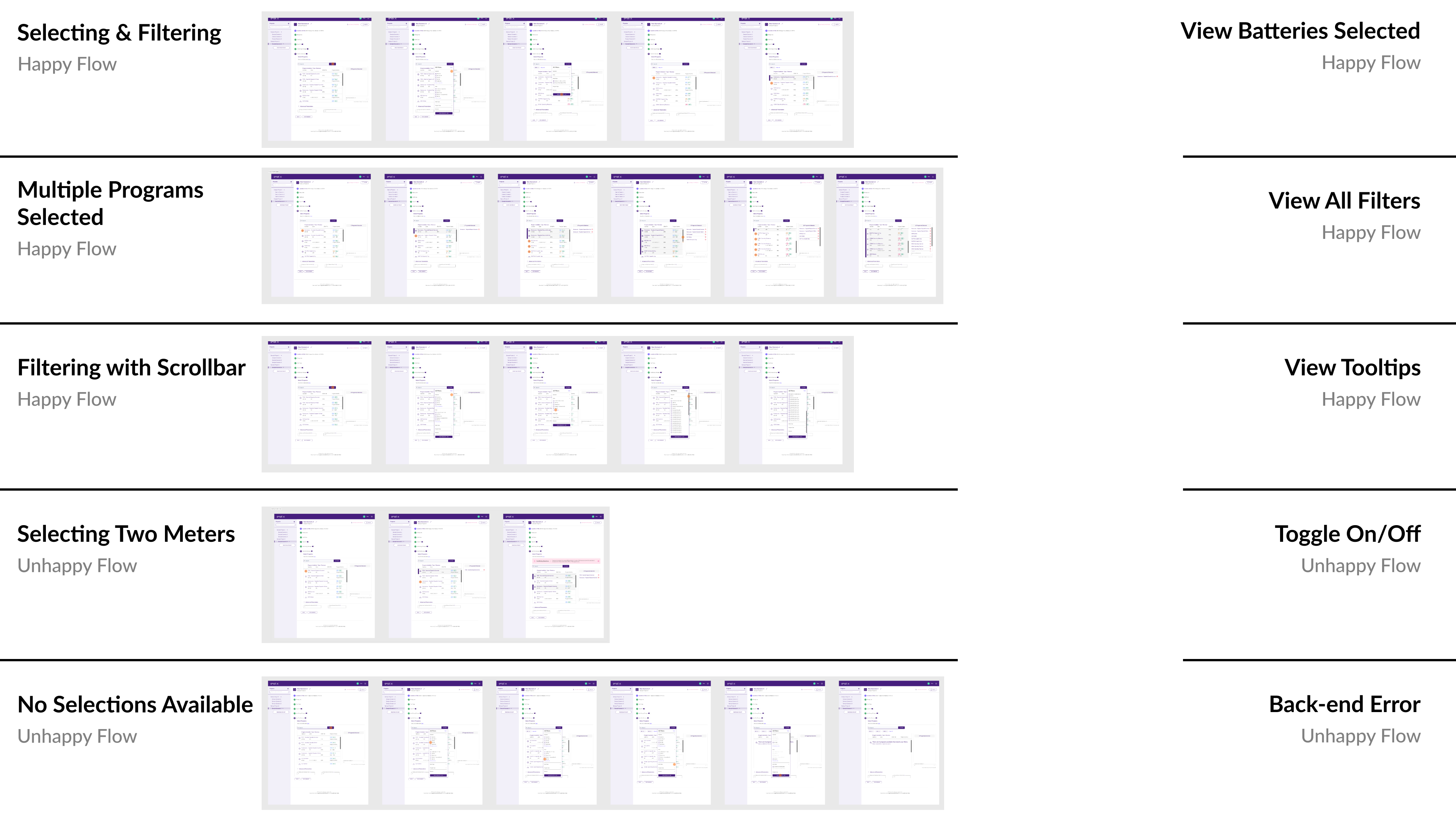
Use case coverage
I documented eight use cases covering core tasks such as filtering and selecting programs, managing multiple selections, and viewing active filters, alongside edge cases including conflicting meter selections, empty states, and system errors.
Mapping these scenarios ensured the design was resilient and ready for real-world implementation.
Mapping these scenarios ensured the design was resilient and ready for real-world implementation.
Post-Implementation
Business impact
Launch is only the beginning of the design process.
After release, we track user behavior, performance metrics, and feedback to validate decisions and uncover opportunities for iteration.
After release, we track user behavior, performance metrics, and feedback to validate decisions and uncover opportunities for iteration.
Increased Efficiency
Streamlined navigation reduced the time solution engineers spent selecting programs by 30 minutes per session, freeing them to focus on client-facing work instead of parsing data tables.

Gained Client Acquisitions
The redesign contributed to securing 4 new enterprise partnerships, including Tesla and Amazon, within 3 months.

Enhanced Website Usability
Post-launch eye-tracking and click analysis showed ~30% decrease in average time on page and more direct paths to program selection with fewer backtracking clicks.