

Textbook to screen
Redesigning how Amplify's digital textbook experience aligns with its print counterpart
Scroll to Explore
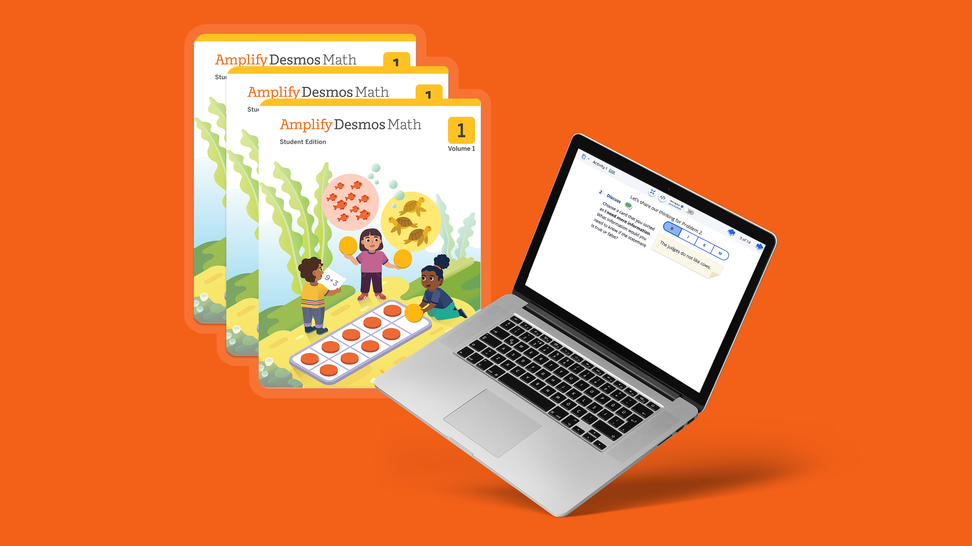
Overview
Amplify's Teacher Pairing Screens (TPS) give teachers a digital presentation to use at the front of the classroom, replacing the projector setups many schools relied on before.
While students follow along in their Student Edition (SE) physical textbooks, the TPS mirrors that same content on-screen for the whole class, but with interactive elements layered in: where a student would normally write or draw in their textbook, the TPS gives the teacher a matching space to write or draw digitally, alongside tools like calculators, shapes, and color options.
While students follow along in their Student Edition (SE) physical textbooks, the TPS mirrors that same content on-screen for the whole class, but with interactive elements layered in: where a student would normally write or draw in their textbook, the TPS gives the teacher a matching space to write or draw digitally, alongside tools like calculators, shapes, and color options.

Introduction
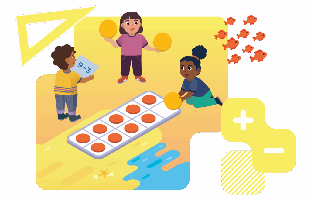
This project aimed to create a more one-to-one experience for students by helping them recognize that the problem they see in their Student Edition (SE) textbook is the same as the one shown on the Teacher Pairing Screens (TPS).
The initiative eliminated confusion and ensured consistency between the student and teacher resources.
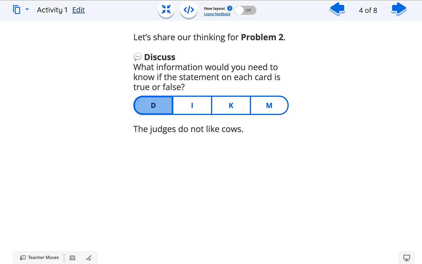
Before
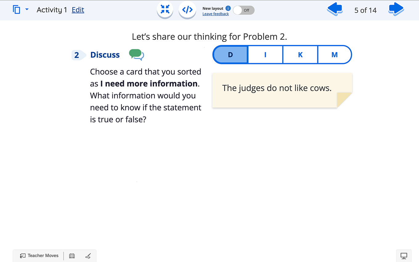
After
Click any image to enlarge.
Duration
4 Months (Nov - Feb 2025)
Role
Lead UX/UI Designer
Client
Amplify Math
The Problem
Students are confused by inconsistencies between the problems in their Student Edition (SE) textbooks and the Teacher Pairing Screens (TPS), which hinders their learning experience.
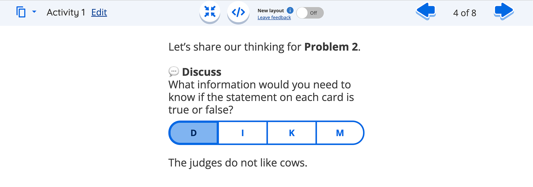
Original Teacher Pairing Screens (TPS) UI
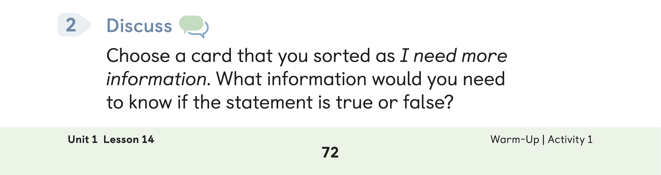
Student Edition (SE) Textbook
Click any image to enlarge.
How might we
create a consistent learning experience between the SE and the TPS to enhance student understanding and eliminate confusion?
Research
Overview
To understand how students and teachers actually experience the disconnect between the SE and TPS, I ran three parallel research efforts: classroom observations, teacher focus groups, and ongoing cross-functional syncs with Product and Curriculum.

Classroom
Observational Studies

Observed students’ behaviors and workflow in their physical classroom
17 - 20 Students per Classroom
1 - 3 Teachers per Classroom

3 Focus Group Interviews
Interviewed 2 - 4 teachers (Kindergarten, 4th, and 5th grade)
Asked each group a consistent set of questions, encouraging open responses
Compared and contrasted insights across the different grade levels and teaching contexts.

Cross-functional
Research Syncs
Held bi-weekly meetings with Product and Curriculum teams
Collectively discussed and shared insights from our research findings
Deep dive
Classroom
observational studies
The purpose was to understand how K-5 students and teachers in an Amplify deployed School District interact with the problems on the TPS as presented in the SE.

6 Classrooms

17 - 20 Students per classroom
1 - 3 teachers per classroom
Stakeholders
We collaborated with teachers, school administrators, and specific Amplify administrators to gain a deeper understanding of the technical implementation, maintenance, and alignment of the TPS and SE with the educational needs of their students.
Process
Sat at the back of the classroom to maintain an unobtrusive presence
Observed student interactions with both the SE and TPS screens
Captured supporting photos, ensuring that student faces were excluded
Findings

Confusion
Students faced confusion due to unclear problem displays, resulting in incorrect problem-solving
More Spacing
Teachers had to manually write the problems on screen, highlighting the need for consistent problem display and ample space for student input
Navigation
Students occasionally forgot the intended problem and began solving a different from their SE

.png)
The current SE problems [on screen] are not helpful at all.
The students need to recognize what is happening through repetition.
They need to see exactly the SE on screen.

Teacher #6
2nd Grade Teacher
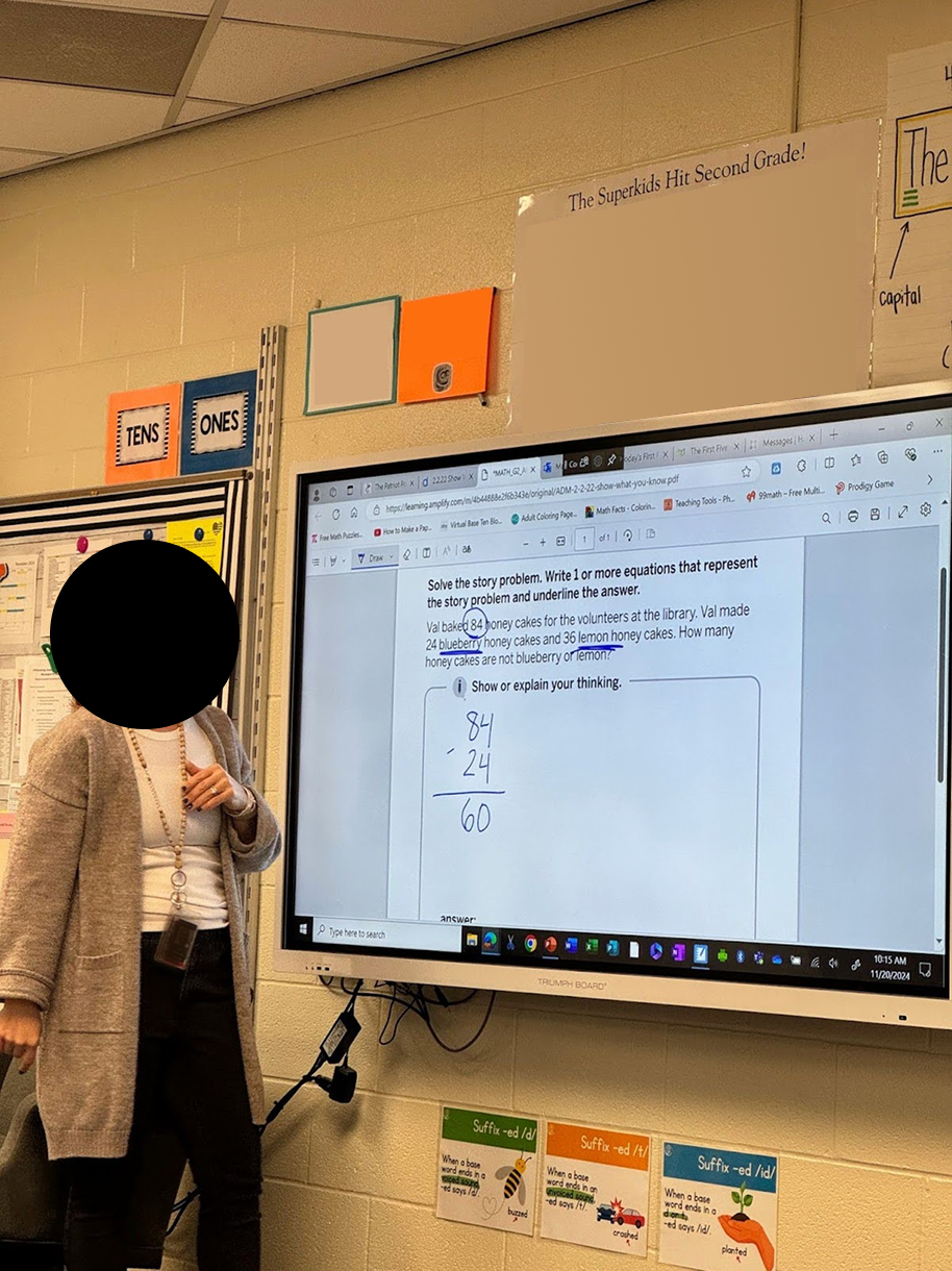
Example of Teacher Using SE PDF
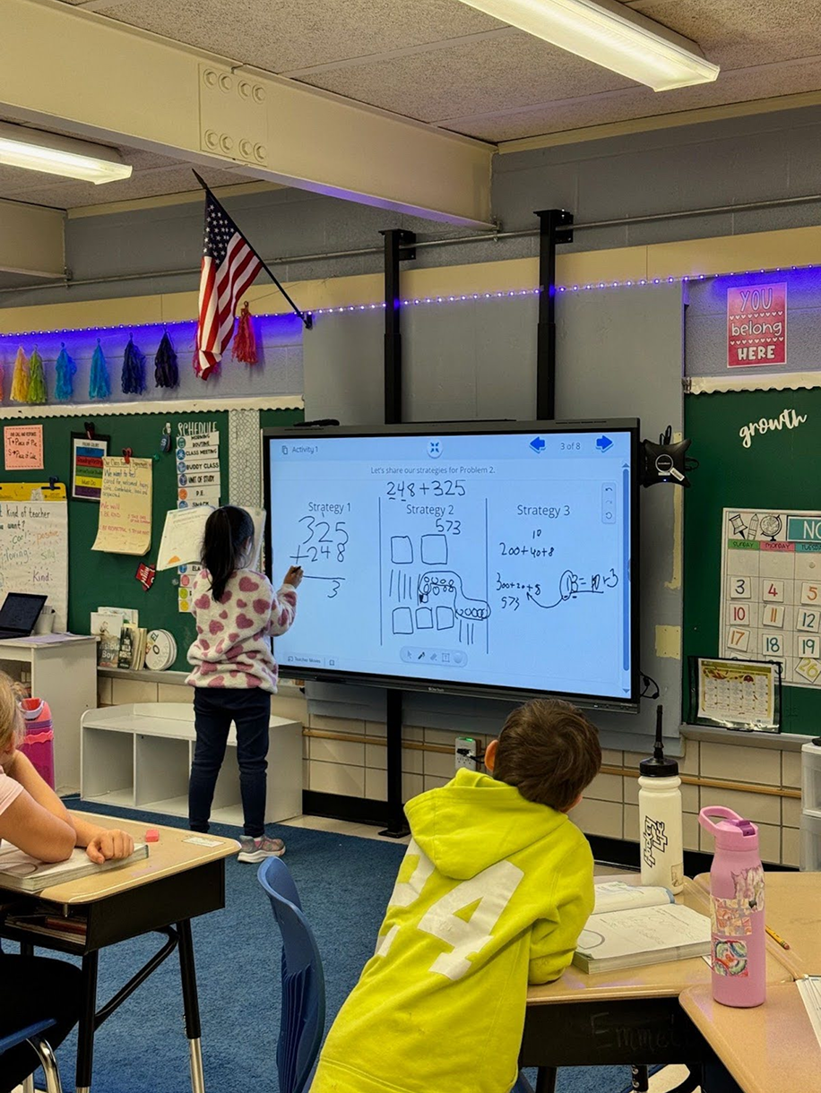
Example of SE Written on Screen
Ideation
Low-Fidelity
After our research, I beagan sketching multiple layout concepts.
%201.png)
Low-Fi Mockup from Balsamiq
Key points

Apply a consistent background shape behind problem numbers to ensure visual uniformity

Utilize the same icon adjacent to the bold “Discuss” text for clarity and brand recognition

Maintain the same language as the SE to reinforce a cohesive user experience
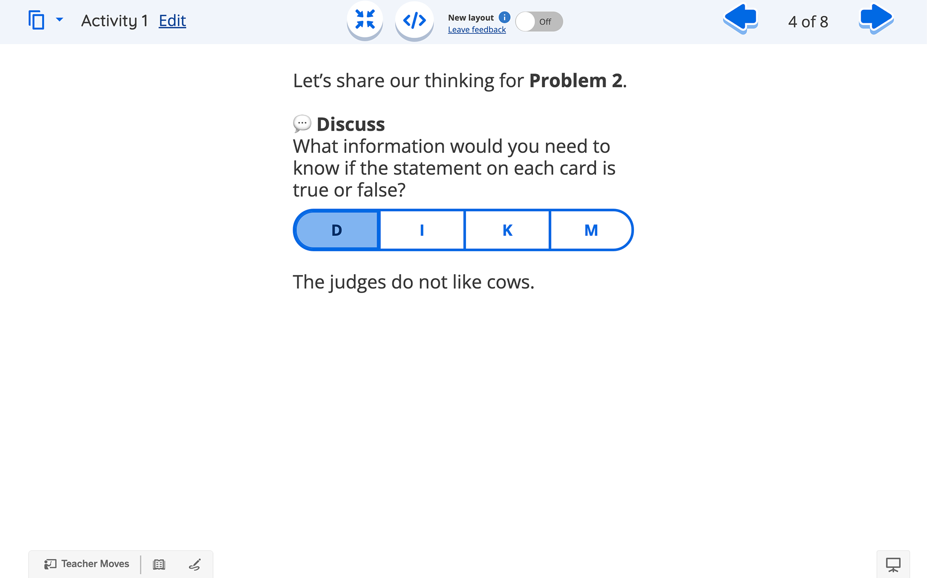
Original TPS Screen
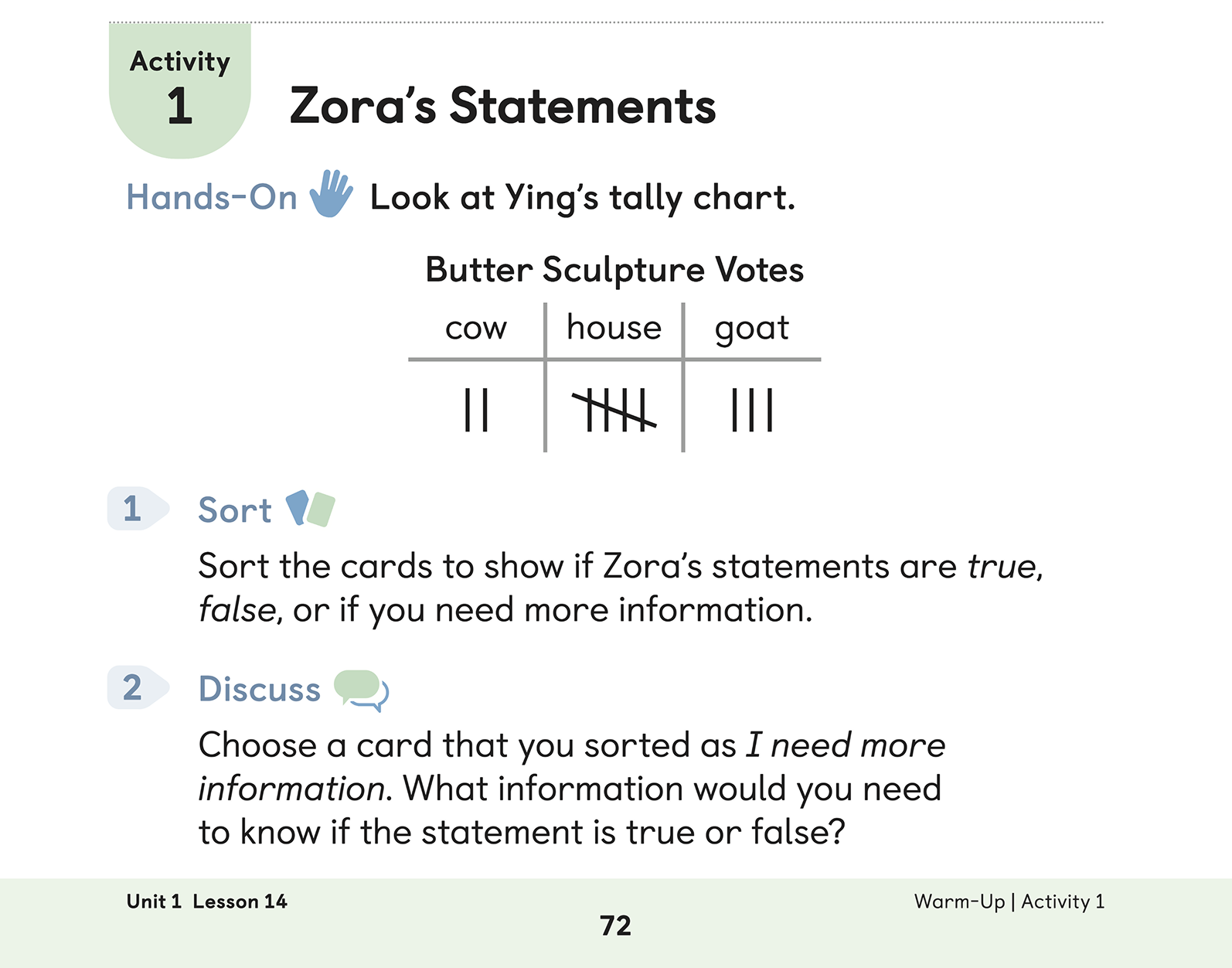
SE Textbook
Click any image to enlarge.
Design Principles
Before I start any project, I set a few design principles to keep myself on track, goals I return to throughout the process.
Establish a Clear Connection Between SE and TPS
We must ensure that students can seamlessly connect the SE content with the TPS. This alignment is crucial to prevent any hindrances in their learning process.
Establishing a clear connection between these platforms should be a fundamental aspect of the problem's overall design, ensuring a cohesive and supportive learning experience.
Establishing a clear connection between these platforms should be a fundamental aspect of the problem's overall design, ensuring a cohesive and supportive learning experience.
Maintain Consistency Across Platforms
It's vital to maintain consistency between the SE and TPS. This involves using uniform design elements, terminology, and content presentation, which will reduce cognitive load and build familiarity.
We must focus on patterns that support learning through repetition, enhancing understanding and educational outcomes for students and educators.
We must focus on patterns that support learning through repetition, enhancing understanding and educational outcomes for students and educators.
Enhance Visual Clarity and Accessibility
Prioritize visual clarity and accessibility in the design. Ensure clear typography, ample spacing, and distinct visual hierarchies to adhere to accessibility standards. This ensures that information is easily accessible and navigable for all users.
Enhancing visual clarity will help students and teachers quickly identify relevant content and focus on learning objectives without unnecessary distractions.
Enhancing visual clarity will help students and teachers quickly identify relevant content and focus on learning objectives without unnecessary distractions.
Design Adaptation
Accessibility
Since these colors would be projected at the front of the room, I ran an accessibility check to see if students in the back could actually read them.
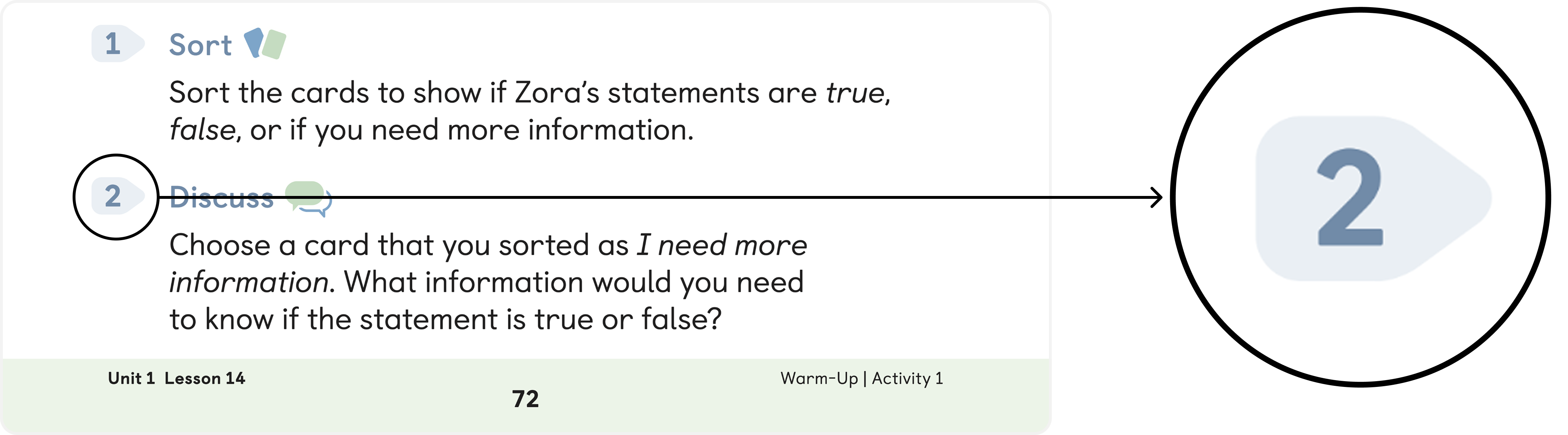
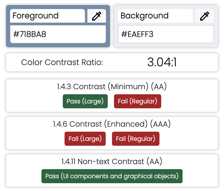
Color Contrast Test by Pivotal Accessibility
Why this matters
These colors would be projected at the front of the classroom, not viewed up close on a screen. If students in the back row can't distinguish the text from the background, they lose the ability to follow along.
Process
Ran the textbook's foreground/background color pairing through a WCAG contrast checker
Result: 3.04:1, below the 4.5:1 minimum for regular text (AA), and well below the 7:1 enhanced standard (AAA)
The average elementary classroom is ~900 sq ft, which puts the back row about 20-25 feet from the front, well past the distance where a marginal contrast ratio is forgiving
Flagged the pairing as a barrier to legibility, especially for students seated farthest from the screen, and used this as evidence to push for higher-contrast color choices in the redesign
Compatibility
Our platform's native components couldn't recreate the layout the textbook required, so we used Polypad — an existing interactive canvas — to build custom screens that matched the textbook's problem structure exactly.
.png)
TPS Platform
Constraints
Teacher-pairing screens (TPS) only supported emoticons
Emoticons needed manual checks across iOS, Android, and Windows for consistent rendering
SE (student edition) required custom icons to visually align, which standard components couldn't support
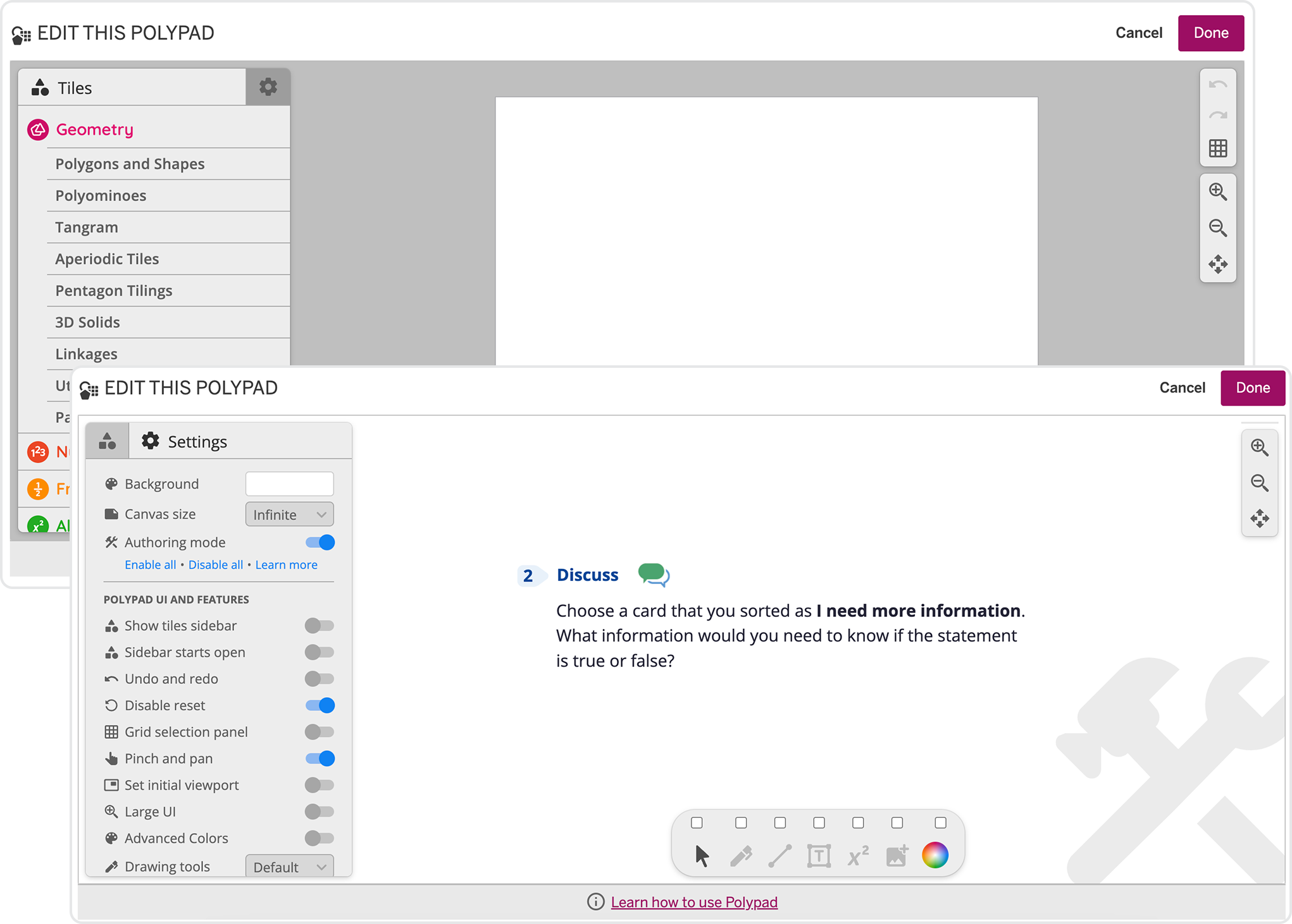
Polypad User Interface
Solution
Found an underused Polypad feature, built by one of our engineers, that allowed custom icon imports
Originally built for shape interactives and games, not icon-based screens
Asked to repurpose it for our use case
Notes
After talking it through with the engineer, we got the green light to use Polypad for our solution.
It opened up new possibilities for future activities where we wanted the on-screen problems to visually echo the SE, and it reinforced how much is possible when cross-functional teams collaborate closely.
It opened up new possibilities for future activities where we wanted the on-screen problems to visually echo the SE, and it reinforced how much is possible when cross-functional teams collaborate closely.
Prototype Development
First Prototype
After conducting our research, we narrowed our ideas into three design directions that best addressed the solution engineer’s workflow and comparison needs.
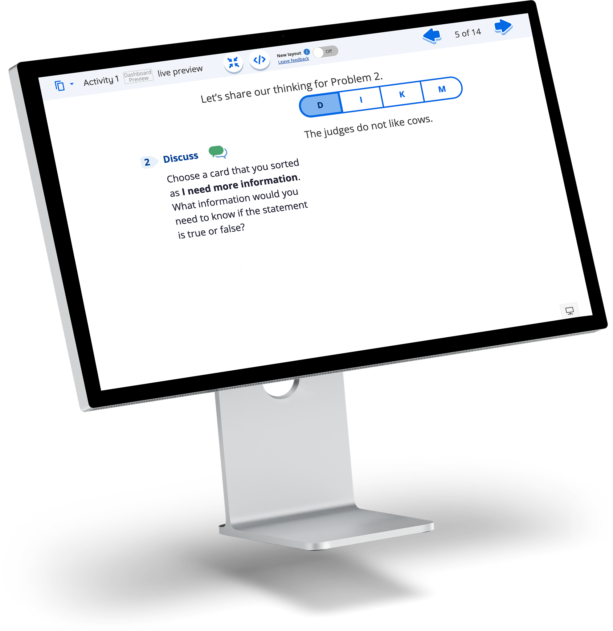
Key Ideas
Applied a consistent background shape behind the darker problem number to maintain visual uniformity

Used the same textbook icon next to the bold "Discuss" text to enhance clarity and reinforce brand recognition
.png)
Internal Testing
With a working prototype, I brought it to the internal team for testing. Their feedback on screen ratios, padding, and text consistency pointed to a few key layout fixes before moving forward.
.png)

.png)
How will this look in a 4:3 ratio?
Or a 1:1 ratio?
.png)
Internal Team Member
Principal UX Designer
Stakeholders
5 Internal Design Team Members
Team Members had deep knowledge of the SE textbooks. Many were former teachers or had extensive experience interviewing teachers and students, while others had conducted classroom observations across various school districts.
Findings

Consider varying screen layouts to maintain consistency
Apply appropriate padding for a visually appealing design
Ensure the text size within Polypad matches the existing text on our screens
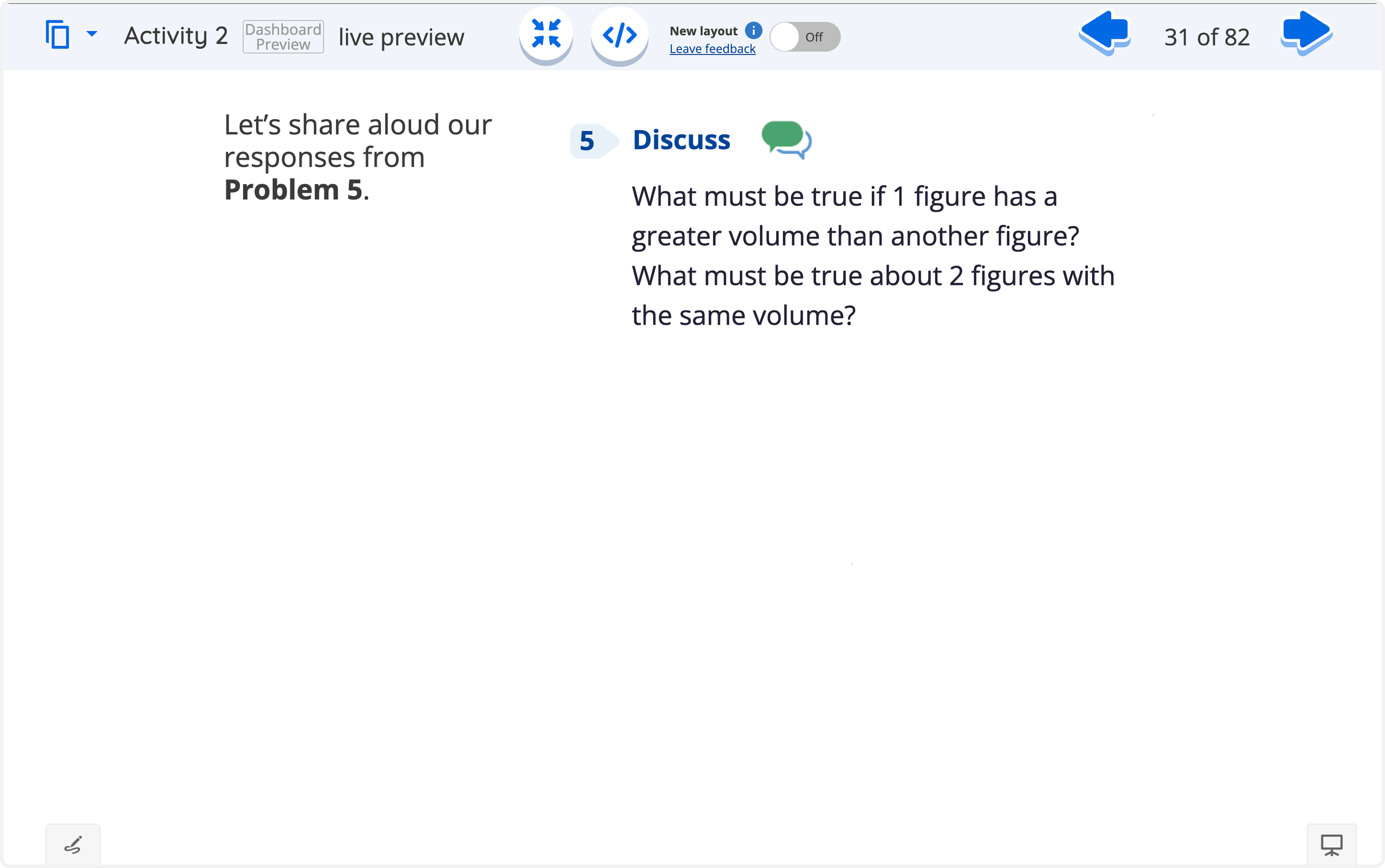
Ratio 4:3 Layout
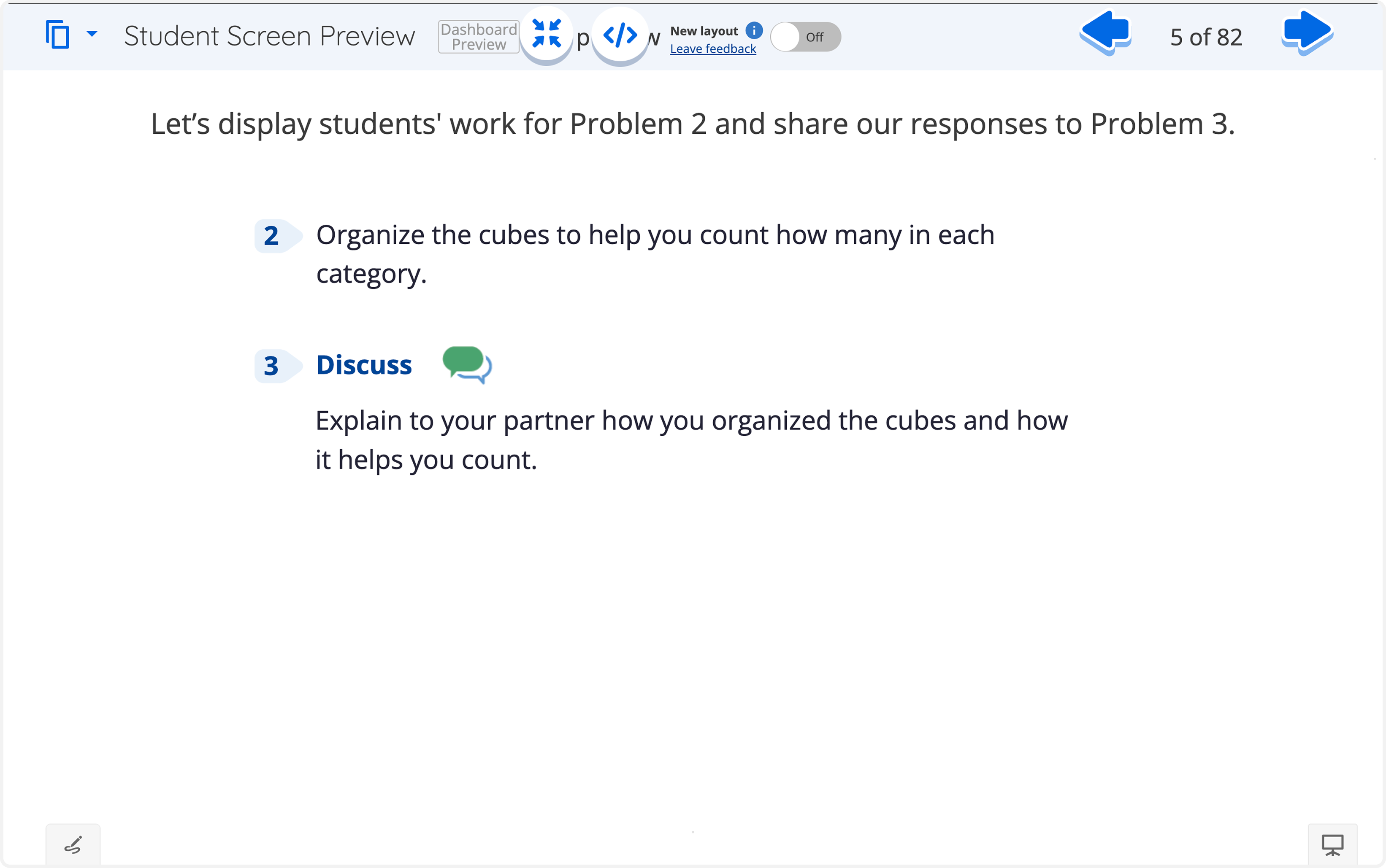
Ratio 16:9 Layout
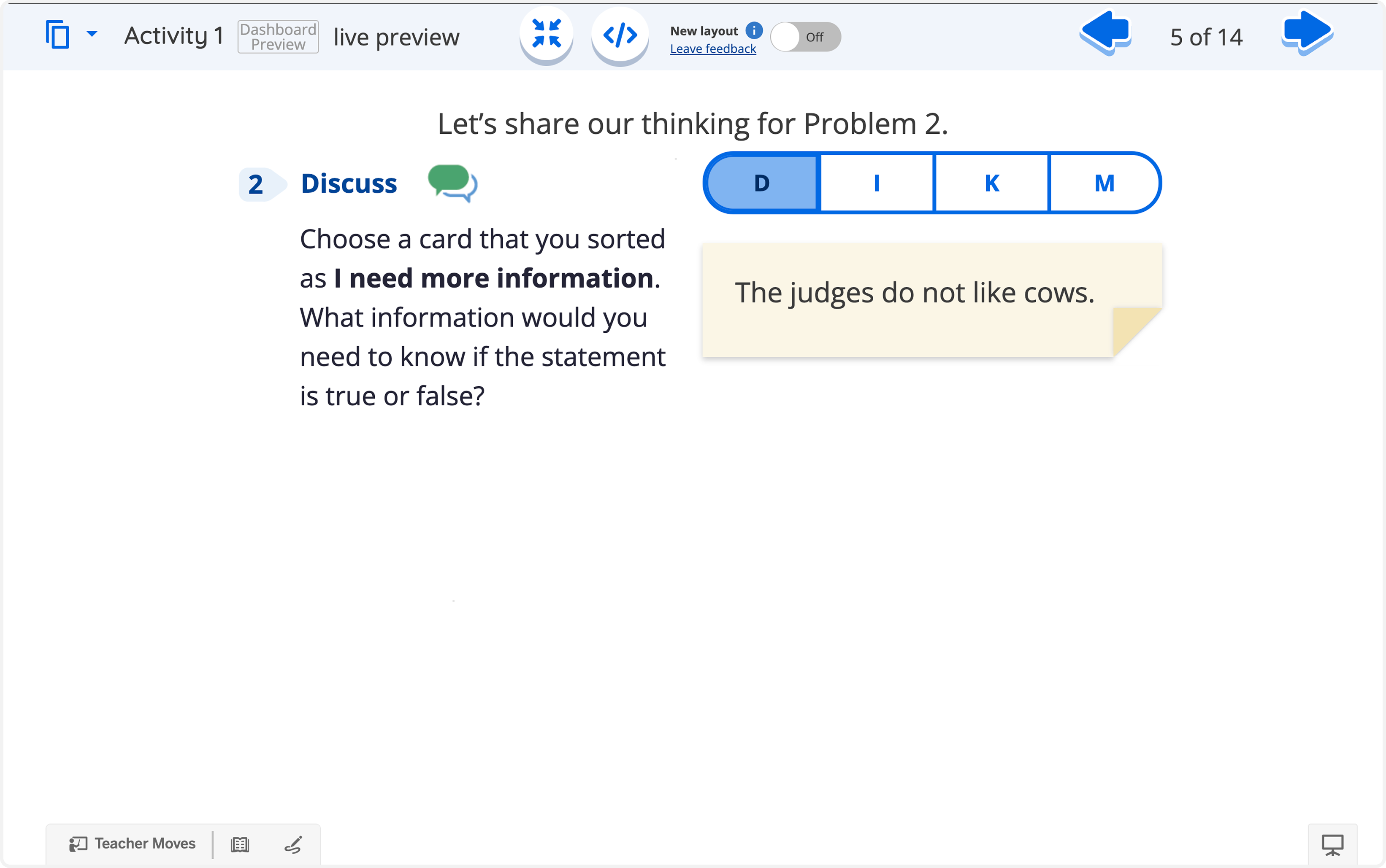
Ratio 1:1 Layout
Resolving Text Consistency
To meet the finding that Polypad's text should match our existing screens, we tested formatting across the platform's three primary layout ratios.
Ratio 4:3 - Assessed padding and line length against denser problem statements
Ratio 16:9 - Tested wider viewports where padding needed to scale proportionally
Ratio 1:1 - Checked how shorter text blocks held up in the most compact layout
Testing across ratios confirmed a consistent formatting approach that held up regardless of screen shape.
Final Design
Design Correlation
With Polypad in place, we turned to the finer details, making sure numbers, icons, and text formatting matched the SE precisely.
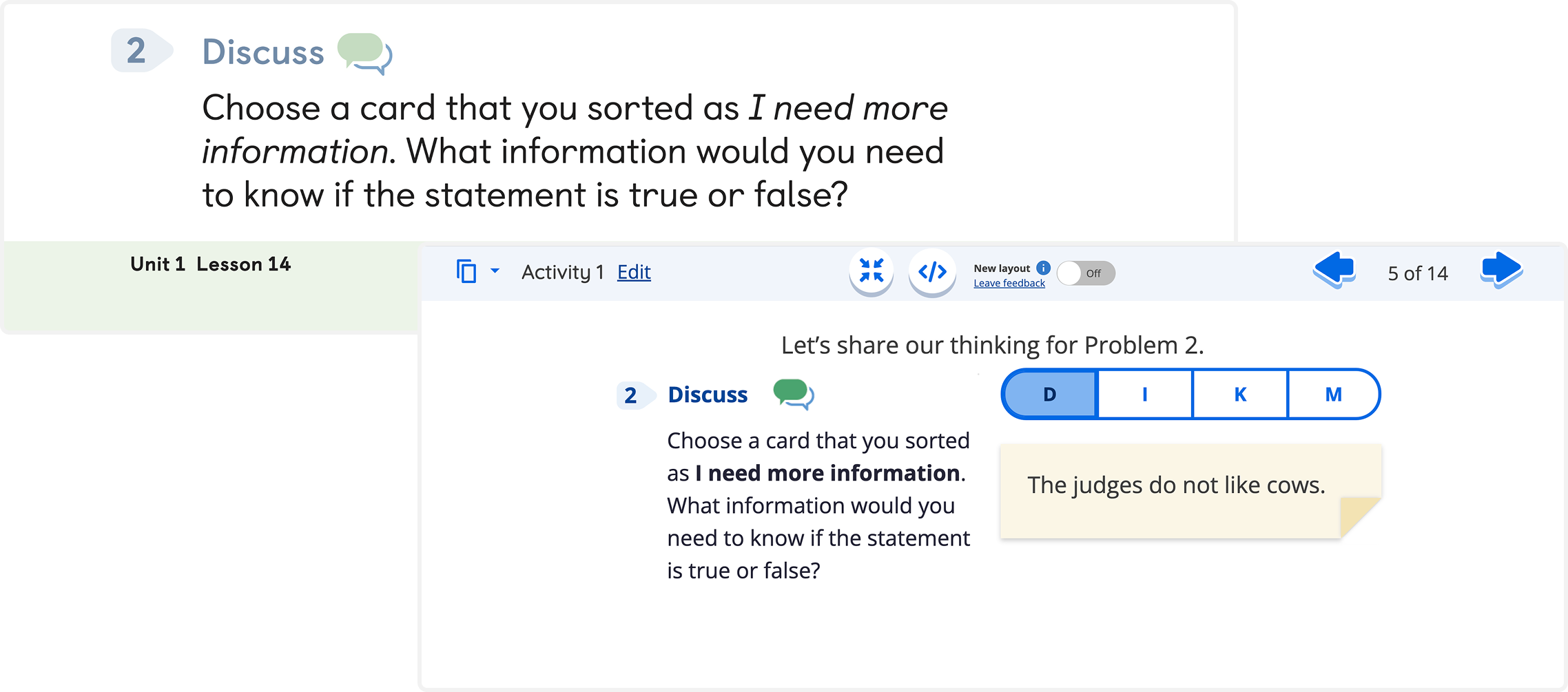
Visual consistency
Implemented darker problem numbers and text colors to meet WCAG standards
Used a consistent background icon behind the numbers that matched the SE
Retained the same Discuss icon next to each activity header (e.g. Discuss, Explain, Justify...)
Result: formatting matches the SE precisely
SE Textbook
.png)
Redesign of TPS Screen
Click any image to enlarge.
Handoff
Design Library
I built a reference doc for the design team to keep problem-number icons, activity icons, and color values consistent with the SE across units, specifying exact icon sizing (1:1 grid) and RGB values for odd/even unit number colors.
.png)
Design Templates
To support every use case across the curriculum, I built a set of approved templates so designers had a consistent starting point instead of designing each screen from zero.
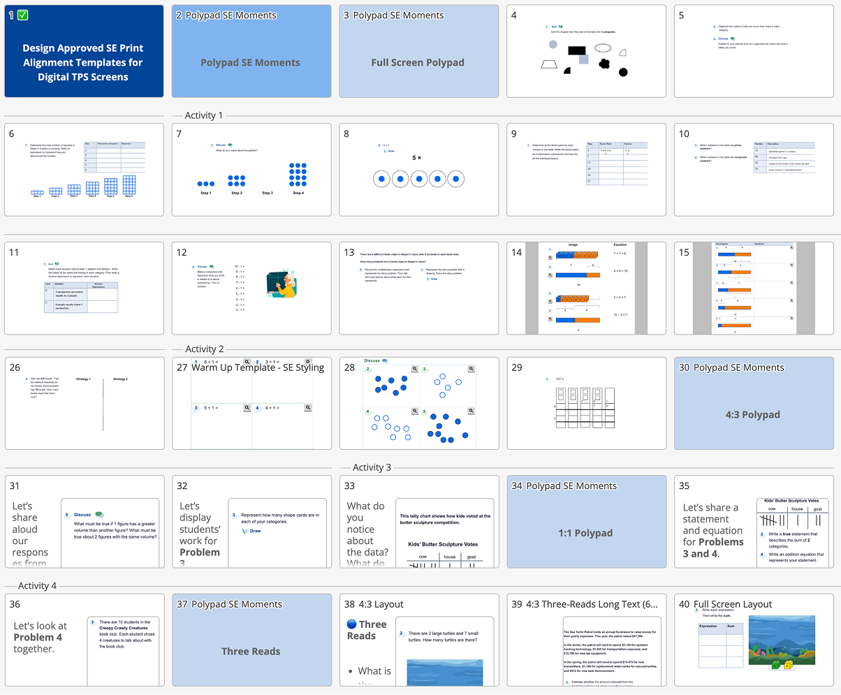
Design
Specifications
To support every use case across the curriculum, I built a set of approved templates so designers had a consistent starting point instead of designing each screen from zero.
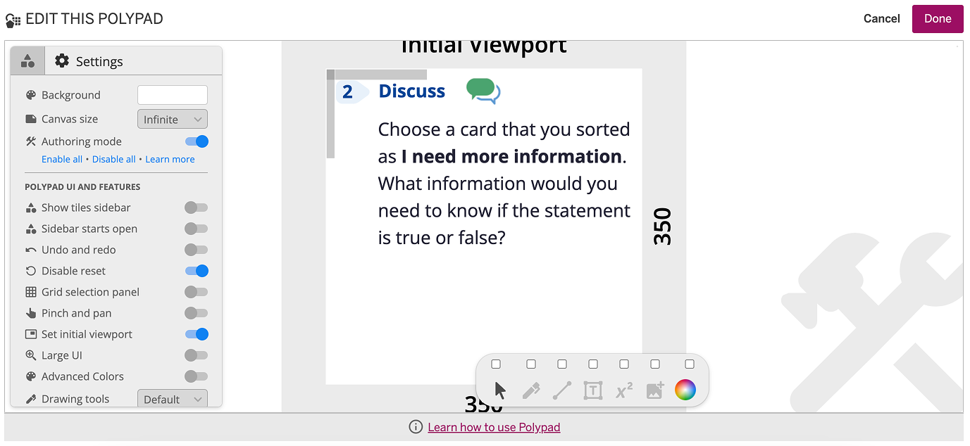
1:1 Design Spec
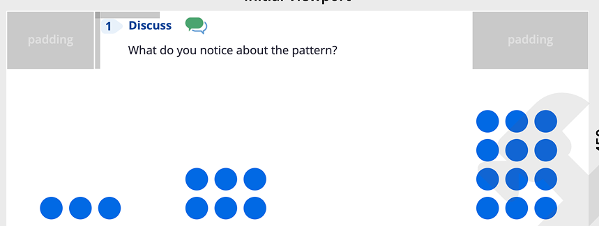
16:9 Design Spec
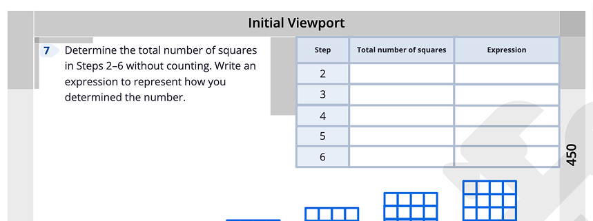
16:9 Design Spec with a 1:1 Layout Inside
Post-Implementation
Business impact
Launch is only the beginning of the design process.
After release, we track user behavior, performance metrics, and feedback to validate decisions and uncover opportunities for iteration.
After release, we track user behavior, performance metrics, and feedback to validate decisions and uncover opportunities for iteration.
Increased Teacher Satisfaction
& Engagement
By aligning screen designs with textbooks and adhering to accessibility standards, we anticipate improved teacher satisfaction and engagement, resulting in increased adoption and retention rates of our educational product.

Increased Trust
By actively listening to teachers and incorporating their feedback, along with engaging them in person to understand their preferences and critiques, we foresee building increased trust and goodwill, potentially leading to favorable recommendations, higher retention rates, and renewals.
.png)